Interpretation Usage
The Interpretation Usage report shows the number of API requests for interpretation over the selected period of time. The report includes number of requests, outcomes, and corresponding response codes, for each application.
In addition to the use of report filters, Nuance Insights allows you to manipulate displayed data through several other means in order to better visualize information. Select from the following to learn more:
Note: This report is applicable only for clients using the Conversational AI channel.

| Column | Description |
|---|---|
| Web App | Web application |
| API | API command (for example, interpretation) |
| Outcome | Result status indicator |
| Response Code | Code returned in the command response. For a successful request the code is 200. Codes above 1000 are API error codes. |
| Count | Total number of requests for this combination of dimensions |
Visualizations
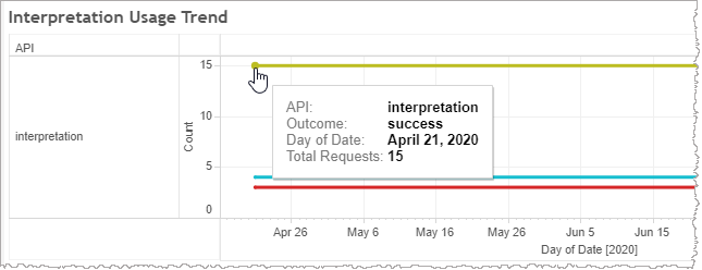
Interpretation Usage Trend graph
This trend line graph plots the number of interpretation requests over time. Each trend line is color-coded by outcome. Mouse over data points to see relevant interpretation usage data in a tooltip.
Tables
The Summary table immediately following the trending graph is a tabular representation of the data. The Details table at the bottom of the page draws from the same data set but groups the information by date stamp.
Filters
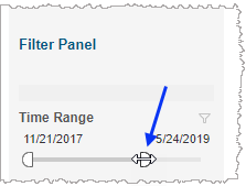
Time Range
The Time Range slider allows you to narrow or expand the date range. The data displayed in all visualizations automatically reflect the subset of information falling within the selected range.
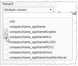
Tenant
By choosing one or more tenants from the list, you refine your displayed data-set by including data from only those tenants matching the selection. The visualizations automatically reflect the information complying with the tenant selection.