Traffic
The Traffic report visualizes raw traffic data of conversations plotted over a given period of time for data belonging to the aggregate channel selection. There are two different sections: Conversations Over Time and Average Conversation Duration Over Time. Conversations Over Time visualizes the change in the conversation raw count over time and broken out by channel. Average Conversation Duration Over Time describes the change in the average conversation duration over time and broken out by channel.
In addition to the use of report filters, Nuance Insights allows you to manipulate displayed data through several other means in order to better visualize information. Select from the following to learn more:
Visualizations
Raw Count
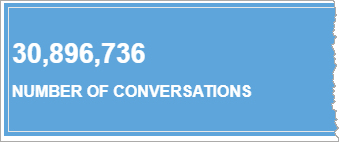
At the top of the report is a widget displaying the total number of conversations across all selected channels.
Conversations Over Time
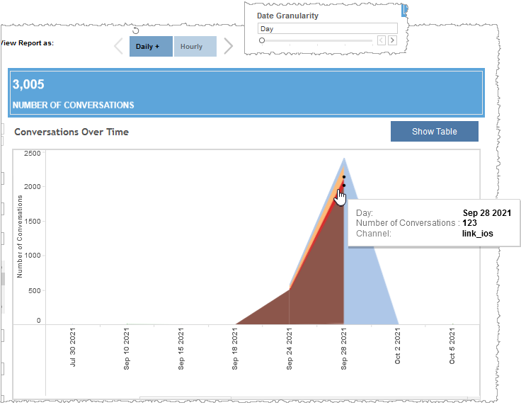
You can view the data for this section either as a stacked graph or in a text-only table. Both formats compare the raw conversation count of individual channels to one another over time.
Note: To see the data from the graphical visualization displayed in an alternative, textual way, click Show Table. To toggle back to the graphical view, click Show Graph.
In the example below, the report draws upon daily summarization data and each data point represents a day-long (24-hour) date granularity. There were 123 conversations on September 28th, 2021 within the link_ios channel. The graph shows that the 123 conversations for the link_ios channel (color-coded as red) was a very small fraction of the number of conversations for the uisdkweb channel for the same data point (color-coded as brown).
Avg. Conversation Duration Over Time
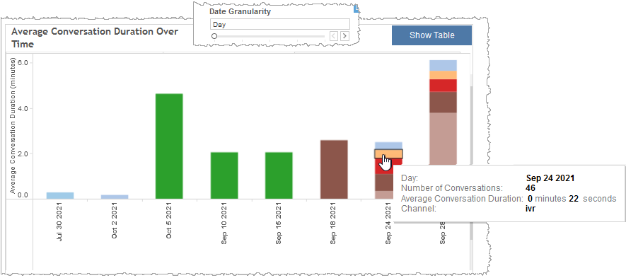
You can view the data for this section either as a graphical visualization or in a text-only table. Both formats visualize the average conversation duration within a specified date range for consecutive periods of time. In the graph, each bar represents all conversations in the data point defined by the date granularity and the choice of hourly or daily summarization data. Each color-coded segment within each bar represents the average conversation duration for a given channel for that data point. The table lists average conversation duration by channel and trended over time.
Note: To see the data from the graphical visualization displayed in an alternative, textual way, click Show Table. To toggle back to the graphical view, click Show Graph.
In the example, below, the date granularity filter divides the displayed data into day-long (24-hour) data points. The ivr channel in the day-long period of September 24th, 2021, had 46 conversations with an average conversation duration of 22 seconds.
Filters
Increase the specificity of your view's reporting by applying filters to the data.
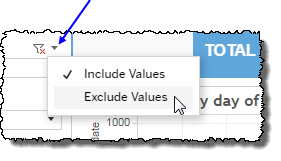
Clicking Include values displays only those data possessing the selected values. All other data are hidden from the visualization.
By contrast, clicking Exclude values displays only those data that do not possess the selected values.
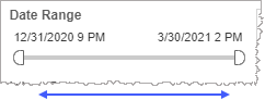
Date Range
The Date Range filter is a slider with two moveable sides. By narrowing the date range, you display only data falling within the range.
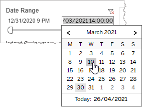
In addition to the slider, the filter allows you to specify start and end points to the range by time of day as well as by date by clicking the Start and End regions, clicking a second time on the time of day, and then manually entering a new time of day.
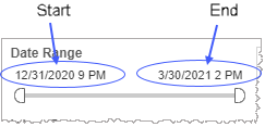
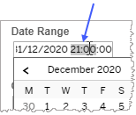
To select a date with the date picker, click the Start region to pick a date from the date picker widget. Do the same with the End region.
Date Granularity
The Date Granularity filter allows you to adjust the reported data granularity described by the trend lines. Drag the slider horizontally to adjust the granularity of reported data. Alternatively, you can use the left  and right
  arrow buttons to move the slider incrementally.
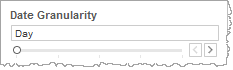
Note: If you choose to draw from hourly instead of daily summarization data, the Date Granularity filter will no longer be visible.
Conversation Outcome
A conversation outcome describes the action taken immediately following the conclusion of the conversation and as a result of a particular exit reason. For example, an outcome may be a transfer to an agent resulting from the Agent Request exit reason. By choosing one or more conversation outcomes from the list, you refine your data-set by including only those outcomes matching the names selected.
- Select all available values by selecting All.
- Select only one value by first clearing the All checkbox, and then selecting the value whose data you would like to see visualized.
-
Select several values by doing one of the following:
- Clear the All checkbox, and then select the values whose data you would like to see visualized.
- Select the All checkbox and then clear values whose data you would NOT like to see visualized.
Conversation Exit Reason
A conversation exit reason is the detected reason the conversation terminated. By choosing one or more exit reasons from the list, you refine your displayed data-set by including only those exit reasons matching the selection.
- Select all available values by selecting All.
- Select only one value by first clearing the All checkbox, and then selecting the value whose data you would like to see visualized.
-
Select several values by doing one of the following:
- Clear the All checkbox, and then select the values whose data you would like to see visualized.
- Select the All checkbox and then clear values whose data you would NOT like to see visualized.
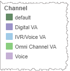
Channel (filter)
By choosing one or more channels from the list, you refine your displayed data-set by including data from only those channels matching the selection.
- Select all available values by selecting All.
- Select only one value by first clearing the All checkbox, and then selecting the value whose data you would like to see visualized.
-
Select several values by doing one of the following:
- Clear the All checkbox, and then select the values whose data you would like to see visualized.
- Select the All checkbox and then clear values whose data you would NOT like to see visualized.
Channel (highlight tool)
Use this filter to highlight data having one or several specified
- In the highlight tool, mouse over the word Channel to see the highlighter icon to the right.
-
Click the highlighter icon to toggle on (
 ) to highlight
 ) to remove highlighting.Notes:
- To make multiple selections, hold down the ctrl key while individually clicking desired
- If you made a highlighter selection of
- To make multiple selections, hold down the ctrl key while individually clicking desired
Custom filters
This report accommodates customizable filters.
Customizable filters narrow the scope of the reported dataset by including or excluding data with identifiable attributes. These attributes may be about the session or about an event that may have happened during the session.
For more information about how to add customized filters to your view, contact your Nuance Professional Services representative.
Note: If you would like to modify this or any report, Nuance Communications, Inc. recommends you contact Nuance Professional Services.
