Selecting a data subset (on-page drill-down)
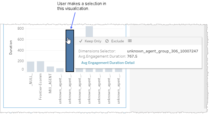
When you select a subset of data points in a graph or table of a report or dashboard, all other visualizations on the page adjust in real-time to filter out the unselected data. The graph or table where you made your selection continues to display all the data but with the unselected parts appearing as faded out. By contrast, the selected data points appear in a vivid color (or darker greyscale). In this way, the graph or table where you first made a selection of a subset of data becomes the independent visualization. The other visualizations are now dependent on the one in which you made that selection and only display data consistent with your selection.
In the example, below, a user selects one bar of a histogram in one visualization on a page and consequently the unselected data points of the same visualization remain visible but faded. Because the user made a selection in this graph (and not another graph), this is now the independent visualization. What is displayed in the other visualizations is dependent upon the selection made in this one.
-
The visualizations shown, below, are examples and may not be from the same report or dashboard you are currently viewing.
If you would like to select a subset of data from a table, click individual cells, individual rows, or row clusters.
Note: Multi-select either using Shift-select or Ctrl-select for multiple contiguous items or multiple but non-contiguous items, respectively.