Intraday Dashboard
Nuance Insights's Intraday Dashboard visualizes metrics in near realtime, refreshing displayed data every minute, by default. Use the filters to display data specific to one, several, or all applications for which you have data, and over various time frames stretching to the present time. You can filter out displayed data also by dimensional values in the same way. The dashboard allows you to choose either a graphical or tabular (text only) visualization of data for each data presentation, according to your preference.
-
Before clicking on the workbook in Tableau, make sure your browser configuration allows 3rd party cookies.
-
Nuance Insights supports navigating and performing operations with a variety of methods, including a combination of keyboard and mouse, keyboard only, having elements on the screen being audibly described (requires 3rd party software like JAWS), and having voice input interpreted (requires Nuance Dragon). See Accessibility for more information.
In addition to the use of dashboard filters, Nuance Insights allows you to manipulate displayed data through several other means in order to better visualize information. Select from the following to learn more:
Visualizations
Consolidated Metric Tiles
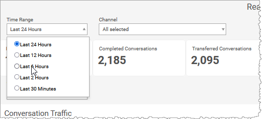
Along the top of the dashboard are raw metrics and calculated metrics from unsummarized log data. These metrics change according to the restrictions of the Time Range and Channel filters.
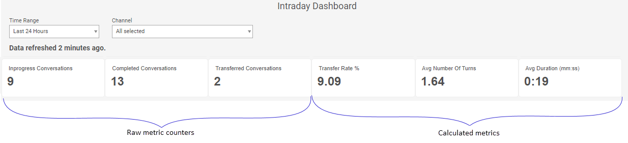
| Item | Description |
|---|---|
| A | Raw metric counters |
| B | Calculated metrics |
Conversation Traffic
You can view data for this section either as a trending graph or in a text-only table. Both formats visualize the raw count of conversations over time. Configure the time interval between data points as five minutes, 15 minutes, or one hour, as desired.
In the example below, the time interval is set to 15min and the Channel filter is set to All selected (meaning no channels are filtered out). The tooltip for the 05:45AM data point displays the conversation count based on data with time stamps between 05:30AM and 05:45AM is 47.
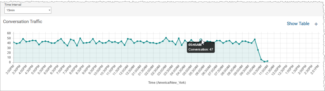
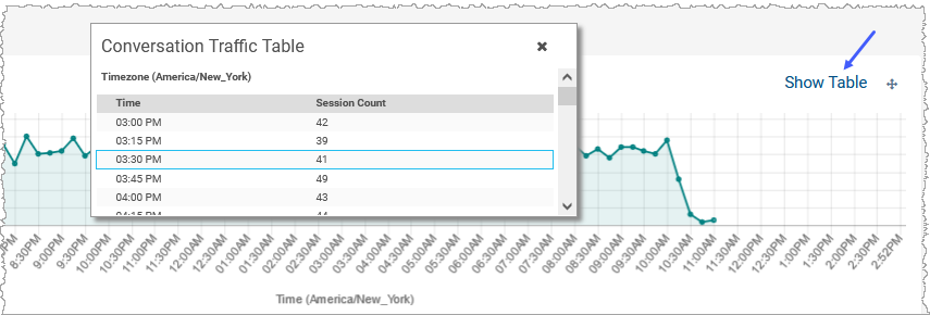
To see the data presented as a table, click Show Table.
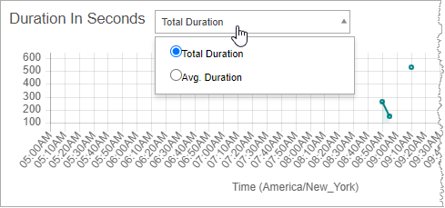
Duration In Seconds
The Duration in Seconds graph displays either the sum of durations for all conversations whose timestamps fall within one time interval immediately prior to the data point, or the average duration calculated from the same subset of conversations. As with the other trending graphs, this graph displays data over time with time intervals varying between one minute and 1 hour, depending on filter settings.
Note: The x-axis of the graph may not increment up consistently through the axis by the configured time interval. If there are time interval buckets that contain no data (to be distinguished from data points in which y=0), those data points are removed from the x-axis.
In the example below, the time interval is set to 15min and the Channel filter is set to All selected (meaning no channels are filtered out). The tooltip for the 10:30AM data point displays the mean conversation duration calculated using data with time stamps between 10:15AM and 10:30AM is 1816 seconds.
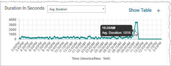
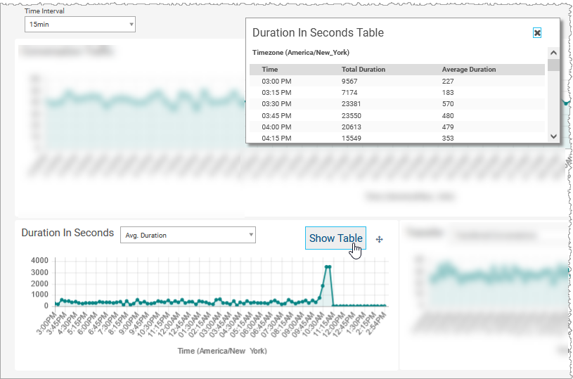
To see the data presented as a table, click Show Table.
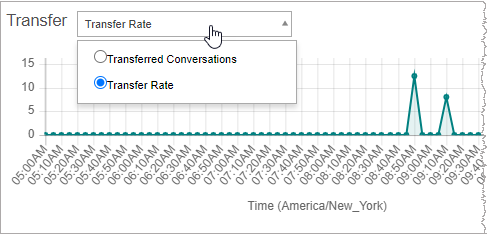
Transfer
The Transfer graph displays either the number of transferred conversations for calls whose timestamps fall within one time interval immediately prior to the data point, or the call transfer rate calculated from the same subset of calls. As with the other trending graphs, this graph displays data over time with time intervals varying between one minute and 1 hour, depending on filter settings.
Note: The x-axis of the graph may not increment up consistently through the axis by the configured time interval. If there are time interval buckets that contain no data (to be distinguished from data points in which y=0), those data points are removed from the x-axis.
In the example below, the time interval is set to 15min and the Channel filter is set to All selected (meaning no channels are filtered out). The tooltip for the 12:15AM data point displays the transfer count based on all conversations between 12:00AM and 12:15AM is 35.
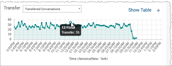
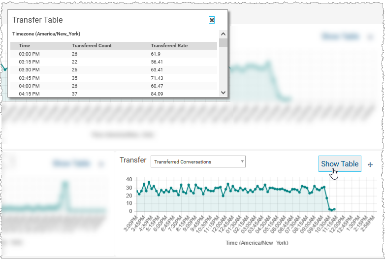
To see the data presented as a table, click Show Table.
Filter scope
When you change the values set in the Time Range and Channel filters, the presented data of the dashboard (in all visualizations) adjust to comply with the filter restrictions.
Time Range restricts the displayed dataset to data timestamped within the specified range.
The Channel filters are multi-select filters. For each of the multi-select filters, the displayed dataset is all data having any one of the filter-specified values for the given dimension, including channel.
The Time Interval filter changes the granularity of the presented data for all three trending graphs.
Note: If the Time Range filter is set to Last 30 minutes, the Time Interval filter disappears and the granularity of all the trending graphs is forcibly set to 1 minute.
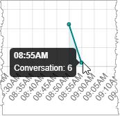
Each data point's value is a raw count or a calculated value. The value is based on the data timestamped for the interval immediately preceding the data point for the duration set by this filter. In the example below (taken from the Conversation Traffic graph), the time interval is set to 5min and the Channel filter is set to All selected (meaning no channels are filtered out). The number of conversations between 08:50AM and 08:55AM is 6.
The Duration In Seconds graph presents, as its dependent variable (y-axis), either the average duration of each conversation or the total duration of all conversation since the last data point. In both cases, changing the Time Interval filter's value has an effect on the calculated value for each data point of the graph. If you are trending the average duration and the time interval is set to 15 minutes, the 2:00am data point will be the average of all conversation durations for the 15 minutes prior to 2:00am. This value will probably change if the time interval is set to 1hr because now the calculation includes all data in the hour prior to 2:00am. Likewise, the calculation of total duration will be a sum of all data within the timeframe - as defined by the Time Interval filter - immediately prior to each data point.
The Transfer graph presents, as its dependent variable (y-axis), either the conversation transfer rate (as a percent value of all conversations since the last data point) or the raw conversation transfer count since the last data point. As with the Duration In Seconds graph, the value of each Transfer graph's data point is calculated based only on data whose timestamps fall between the selected data point and the data point immediately prior to that.