Exit Trending
The Exit Trending report visualizes the relative weighting of exit reasons (each quantified as a percent of the aggregate of all exit reasons) as a trending line over time.
Note: This report is applicable only for clients using the IVR channel.
The visualized data-set can be narrowed down through filtering, either by restricting via date range, or else the selective inclusion of data based on the values of dimension meta-data.
Note: Because this report is outcome-based, your AFO file must be properly defined.
Visualizations
Legend
This legend maps the color codes for both the Exit Reason Trending graph and the state-specific trending histogram. The legend is interactive. To highlight one or multiple exit reasons in the graphs, select the highlight icon in the legend and then select one or more exit reasons by Ctrl-clicking each one, as desired.
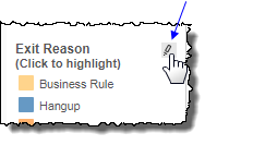
Note: The Exit reason Complete is also known as Contained. A contained call is a call that ended in the IVR and did not reach an agent.
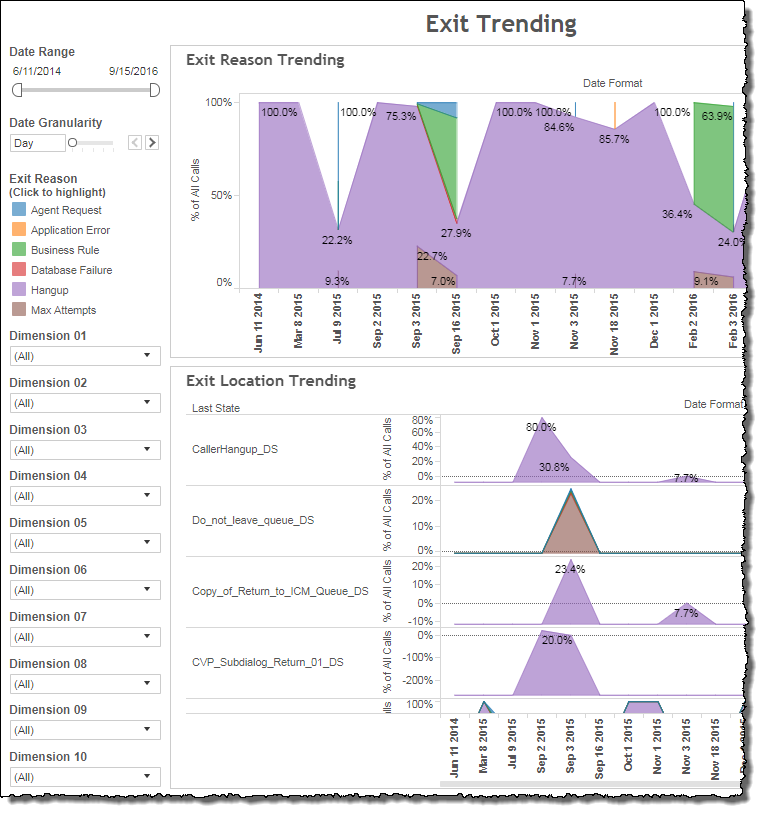
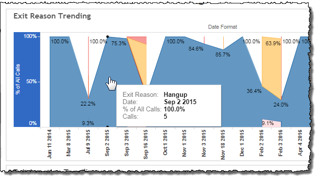
Exit Reason Trending
This graph combines all exit reasons in the data-set and represents them as bands of weighted thickness over time. The thickness of any one band, representing a single exit reason, corresponds to the proportional occurrence of that exit reason relative to all other exit reasons. The data is quantified in percentage points. Mousing over the intersection of any one band on a particular date produces a tool tip displaying the name of the exit reason, the date, and the proportional weight (%) of the exit reason at that point in time.
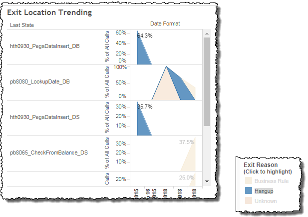
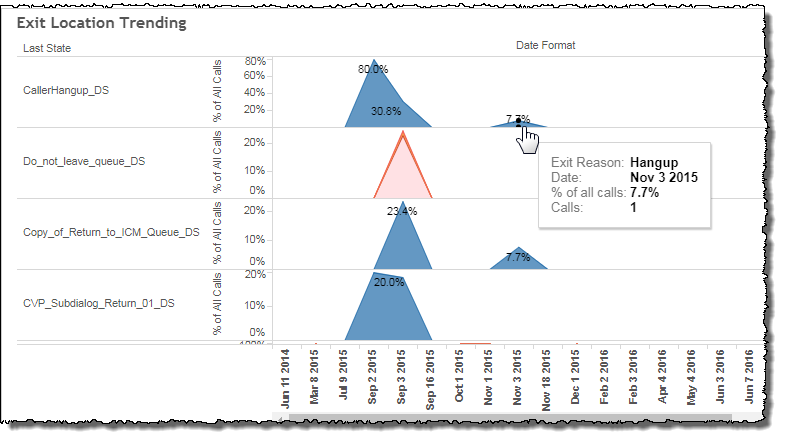
Exit Location Trending
This graph visualizes the proportional occurrence of exit reasons on a per state basis. Each exit reason is represented by a weighted band. It should be noted that each state's aggregate is less than 100% since the exit reason numbers are still being compared to the data for the aggregate of all states.
Filters
The Exit Trending report's filters include Date Range and may include several others depending on what customized filters have been added.
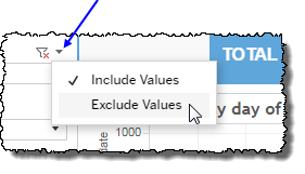
Clicking Include values displays only those data possessing the selected values. All other data are hidden from the visualization.
By contrast, clicking Exclude values displays only those data that do not possess the selected values.
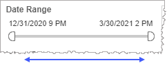
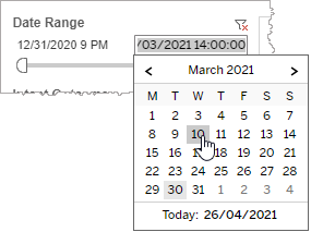
Date Range
The Date Range filter is a slider with two moveable sides. By narrowing the date range, you display only data falling within the range.
In addition to the slider, the filter allows you to specify start and end points to the range by time of day as well as by date by clicking the Start and End regions, clicking a second time on the time of day, and then manually entering a new time of day.
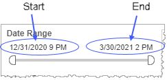
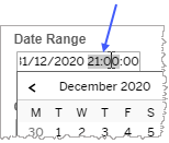
To select a date with the date picker, click the Start region to pick a date from the date picker widget. Do the same with the End region.
Date Granularity
The Date Granularity filter allows you to adjust the reported data granularity described by the trend lines. Drag the slider horizontally to adjust the granularity of reported data. Alternatively, you can use the left  and right
  arrow buttons to move the slider incrementally.

Custom filters
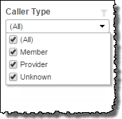
This report accommodates customizable filters.
Customizable filters narrow the scope of the reported dataset by including or excluding data with identifiable attributes. These attributes may be about the caller, the call itself, or about an event that may have happened during the call.
For example, one possible customizable filter you can add and customize in this view is Caller Type, in which you can narrow the reported data to include, or exclude, only those data with the selected caller type.
For more information about how to add customized filters to your view, contact your Nuance Professional Services representative.
Note: If you would like to modify this or any report, Nuance Communications, Inc. recommends you contact Nuance Professional Services.
