Metrics Trending Comparison Dashboard
The Metrics Trending Comparison dashboard presents metrics data on a per metric basis over time.
How this differs from the Metrics Trending Dashboard is that you may choose to include one or all metrics on one chart as well as visualizing the trending of either one of the individual AFO file dimensions or all of them. Additionally, should you choose, you may also show or hide data for on the level of individual dimension values. The Date slider allows you to adjust the time frame the graph visualizes, thereby providing a time-based filter.
Filters
Increase the specificity of your dashboard's reporting by applying filters to the data. The Metrics Trending Comparison Dashboard's filters include: Date, Date Granularity, Metric Name, Metrics Listed and Trending By. Each of these filters are non-customizable. Additionally, the report may include one or more other customized filters depending on what has been configured specifically for your system.
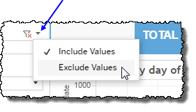
Clicking Include values displays only those data possessing the selected values. All other data are hidden from the visualization.
By contrast, clicking Exclude values displays only those data that do not possess the selected values.
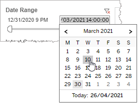
Date
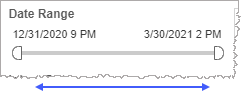
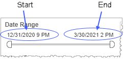
The Date Range filter is a slider with two moveable sides. By narrowing the date range, you display only data falling within the range.
In addition to the slider, the filter allows you to specify start and end points to the range by time of day as well as by date by clicking the Start and End regions, clicking a second time on the time of day, and then manually entering a new time of day.
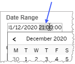
To select a date with the date picker, click the Start region to pick a date from the date picker widget. Do the same with the End region.
Date Granularity
The Date Granularity filter allows you to adjust the reported data granularity described by the trend lines. Drag the slider horizontally to adjust the granularity of reported data. Alternatively, you can use the left  and right
  arrow buttons to move the slider incrementally.

Metric Name
By choosing one or more metrics from the list, you refine your data-set by including only those metrics matching the names selected.
- Select all available metrics by selecting All.
- Select only one metric by first clearing the All checkbox, and then selecting the name of the metric whose data you would like to see visualized.
-
Select several metrics (but a subset of all metrics) either by performing one of the following two actions:
- Clear the All checkbox, and then select the names of the metrics whose data you would like to see visualized.
- Select the All checkbox (or ensure it is already selected), and then clear the names of the metrics whose data you would NOT like to see visualized.
Metrics Listed
You may choose to display only key metrics (or perhaps all BUT key metrics in your visualization) in order to increase the specificity of your graph's data. Selecting All removes the effect of this filter.
Trending By
If your Metrics Trending Comparison Dashboard has customizable filters (and there exists underlying dimension data from the AFO file), the Trending By filter allows you to select which dimension you would like to visualise. By selecting a dimension, the graph ignores all other dimensional data but includes the selected dimension's data. By selecting None (Aggregate View), you remove any filtering effect from this filter.
Custom filters
This report accommodates customizable filters.
Customizable filters narrow the scope of the reported dataset by including or excluding data with identifiable attributes. These attributes may be about the session or about an event that may have happened during the session.
For more information about how to add customized filters to your view, contact your Nuance Professional Services representative.
Note: If you would like to modify this or any report, Nuance Communications, Inc. recommends you contact Nuance Professional Services.
