Dialog Dashboard
The Dialog Dashboard collects in one place visualizations of metrics and calculated metrics of an operational nature such as the number of requests, duration, and successful interactions. The dashboard represents data graphically. To see this data in a tabular format, you can click the Dialog Details Dashboard tab or drill down on any of the dashboard's visualizations. The intended users of this dashboard are business sponsors and business owners.
In addition to the use of dashboard filters, Nuance Insights allows you to manipulate displayed data through several other means in order to better visualize information. Select from the following to learn more:
-
Selecting a data subset in one visualization to add specificity in other visualizations
-
Drilling down from a summary (or dashboard) report to a more detailed report
Visualizations
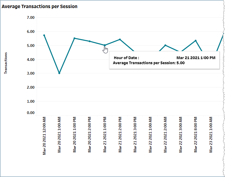
Average Transactions per Session
This graph plots the change in the average number of transactions per session over time. This is a calculated metric (Formula: total_execute_transaction_count / total_session_having_execute_count).
Use the Date Granularity slider to adjust the length of time for each data point during which data is averaged. Use the Date slider to adjust the range of time spanned by the entire graph.
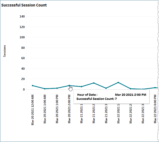
Successful Session Count
This graph plots the change in the number of error-free sessions for a given time granularity (defined by the Date Granularity slider) over time.
In the example, below, there were 7 error-free sessions for the hour starting on March 20th, 2021 at 2:00PM. The entire graph displays all data for the neap260)mixct_testdata_appid1 application (appid filter setting not shown) from March 20th, 2021 to March 25th, 2021 (Date slider setting not shown). This is a raw metric (succ_session_count).
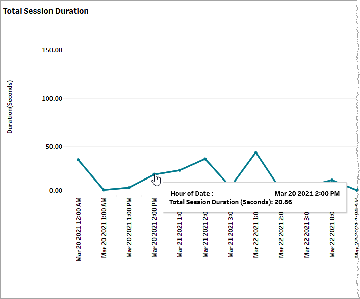
Total Session Duration
This segmented bar graph displays the duration in seconds for a given range of time (defined by the Date slider) on a per time period basis (defined by the Date Granularity slider), and broken out into segments representing aggregate session durations for each of billable sessions and unbillable sessions. Mouse over each segment for a tooltip showing relevant information. This is a raw metric (billable_session_duration).
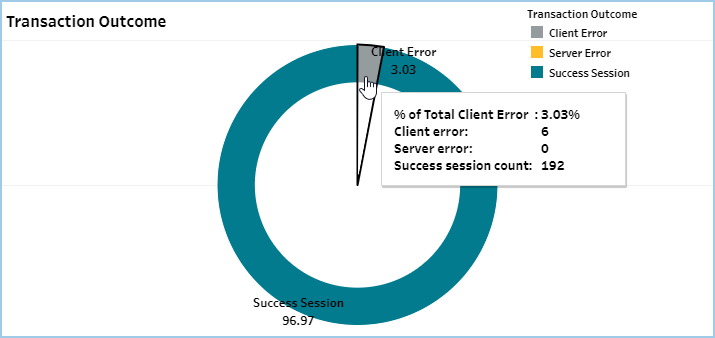
Transaction Outcome
This donut chart visualizes the proportional distribution of transaction outcomes, broadly split out into successful and errored outcomes. Errored outcomes are sub-categorized as being Client Errors or Server Errors. Mouse over any part of the chart for a tooltip with relevant information.
This is a calculated metric divided into two categories: Success and Errored components. The Errored category is further divided into Server and Client error components. The calculation determines the proportion a given component makes up of the total in terms of raw count and expressed as a percent over the date range.
Given the following:
-
A: Number of sessions having no errors within the specified time period (one row of the table spanning a time period whose length is defined by the Date Granularity slider) (
succ_session_count) -
B: Number of sessions having server errors within the specified time period (one row of the table spanning a time period whose length is defined by the Date Granularity slider) (
group2_session_count) -
C: Number of sessions having client errors within the specified time period (one row of the table spanning a time period whose length is defined by the Date Granularity slider) (
group1_session_count)
Formula for Success: A / (A + B + C)
Formula for Server error: B / (A + B + C)
Formula for Client error: C / (A + B + C)
Filtering
The filters in this section allow you to reduce the volume of displayed data on the dashboard.
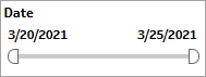
Date
The Date filter is a slider with two moveable sides. By narrowing the date range, you display only data falling within the range.
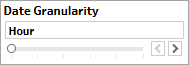
Date Granularity
The Date Granularity filter allows you to adjust the reported data granularity described by the trend lines. Drag the slider horizontally to adjust the granularity of reported data. Alternatively, you can use the left  and right
  arrow buttons to move the slider incrementally.
Appid
This filter selectively reduces the volume of data displayed based on application ID. The filter reduces data by including or excluding one or several applications. Specify one or more applications from the list as required.
Click Include values to display only those data possessing the selected values. All other data are hidden from the visualization.
Click Exclude values to display only those data that do not possess the selected values.