Task Summary
This report summarizes the volume and outcome statistics for each task, on a per channel basis.
The outcomes in this view are grouped into several broad categories providing a more succinct view than in the Task Detail view. Task data is visualized in two sections: Task Usage and Task Outcome Percent Comparison. You can filter by adjusting the time period displayed and selecting one or more channels. Customizable filters are available and depend upon data from AFT![]() An AFT, or after-the-fact-task definition, is an XML file that describes the Start and End states of one or more tasks. (after-the-fact-task) files.
An AFT, or after-the-fact-task definition, is an XML file that describes the Start and End states of one or more tasks. (after-the-fact-task) files.
In addition to the use of report filters, Nuance Insights allows you to manipulate displayed data through several other means in order to better visualize information. Select from the following to learn more:
Visualizations
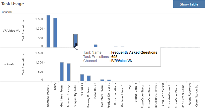
Task Usage
You can view the data for this section either as a graphical visualization or in a text-only table. Both formats visualize the raw count of executions of each task, broken out on a per channel basis. The graph visualizes task execution counts with bar height. The table lists the number of executions textually, broken out by task.
Note: To see the data from the graphical visualization displayed in an alternative, textual way, click Show Table. To toggle back to the graphical view, click Show Graph.
In the example below, there were 695 executions of the Frequently Asked Questions task in the IVR/Voice VA channel, taken from data falling within the date range and complying with all filter constraints.
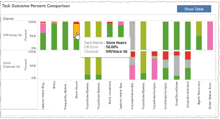
Task Outcome Percent Comparison
You can view the data for this section either as a series of stacked bar graphs or in a text-only table. Both formats visualize the weighting of task outcomes relative to one another for a given task, and on a per channel basis. In the graph, each bar represents 100% of all outcomes for a given task within a given channel. Each segment within a bar is color-coded and represents an individual task outcome. The different segment lengths correspond to the relative weighting of outcomes within a task. The table lists task outcome weightings within a task for a given channel as percent values.
Note: To see the data from the graphical visualization displayed in an alternative, textual way, click Show Table. To toggle back to the graphical view, click Show Graph.
In the example, below, the task named Store Hours had a DB Error outcome for 50.00% of this task's executions in the IVR/Voice VA channel.
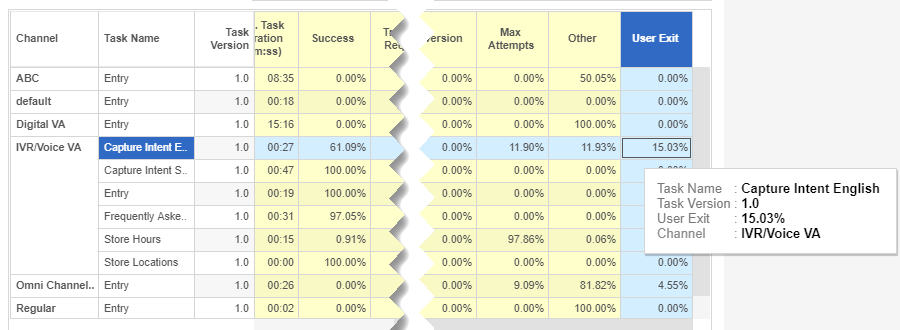
Task Summary table
Both bar graphs' data can be viewed in a single table. The example described in the Task Outcome Percent Comparison graph's description is visible in the table as follows:
Filters
Increase the specificity of your view's reporting by applying filters to the data.
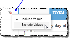
Clicking Include values displays only those data possessing the selected values. All other data are hidden from the visualization.
By contrast, clicking Exclude values displays only those data that do not possess the selected values.
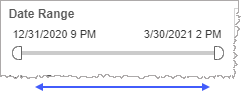
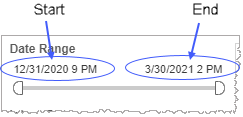
Date Range
The Date Range filter is a slider with two moveable sides. By narrowing the date range, you display only data falling within the range.
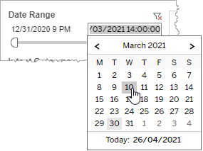
In addition to the slider, the filter allows you to specify start and end points to the range by time of day as well as by date by clicking the Start and End regions, clicking a second time on the time of day, and then manually entering a new time of day.
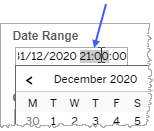
To select a date with the date picker, click the Start region to pick a date from the date picker widget. Do the same with the End region.
Channel
By choosing one or more channels from the list, you refine your displayed data-set by including data from only those channels matching the selection.
- Select all available values by selecting All.
- Select only one value by first clearing the All checkbox, and then selecting the value whose data you would like to see visualized.
-
Select several values by doing one of the following:
- Clear the All checkbox, and then select the values whose data you would like to see visualized.
- Select the All checkbox and then clear values whose data you would NOT like to see visualized.
Task Outcome highlight tool
-
Max Attempts - The percentage of instances of a given task, that ended because the incidence of one or more error types has reached a programmatically set limit on the number of times the error may occur.
- System Error - Any application/system-based errors in the application.
- DB Error - An error encountered during a database lookup.
- Other - The percentage of tasks not falling into other categories of outcomes.
-
Transfer Request - The percentage of instances of a given task, in which a user requests an agent regardless of whether a transfer subsequently is completed by the application.
Note: An Agent Request Transfer (not depicted but available through customization) filters the dataset further by including only those tasks with an agent request that actually ended with a successful transfer to an agent. Through customization, you may or may not be able to use this as a category, depending on whether the data indicating whether a transfer occurred is present in the dataset.
-
Business Rule - The percentage of instances of a given task, in which a business rule was triggered. A business rule is defined, programmatically, to anticipate situations in which a task's completion is prevented, and then to effect a graceful course of actions by the application (possibly but not necessarily ending with a transfer to an agent).
Note: A Business Rule Transfer (not depicted but available through customization) filters the dataset further by including only those tasks that ended due to a business rule and that actually ended with a successful transfer to an agent. Through customization, you may or may not be able to use this as a category, depending on whether the data indicating whether a transfer occurred is present in the dataset.
- Diversion - The user chooses to remain in the application but to not complete the task.
- User Exit - A termination of the conversation initiated by the user.
- Application Exit - A termination of the conversation initiated by the application.
- Success - The rate of successful completion of a task, as a percentage of task starts that ended with a successful completion.
Use this filter to highlight data having one or several specified task outcomes.
- In the Task Outcome highlight tool, mouse over the word Task Outcome to see the highlighter icon to the right.
-
Click the highlighter icon to toggle the highlighter on (
 ) to highlight outcomes, or off (
  ) to remove highlighting.Notes:
- To make multiple selections, hold down the ctrl key while individually clicking desired outcomes.
- If you made a highlighter selection of outcomes and then toggled the highlighter function off, the last selection is preserved when you once again toggle the highlighter back on.
Custom filters
This report accommodates customizable filters.
Customizable filters narrow the scope of the reported dataset by including or excluding data with identifiable attributes. These attributes may be about the conversation itself or about an event that may have happened during the conversation.
For more information about how to add customized filters to your view, contact your Nuance Professional Services representative.
Note: If you would like to modify this or any report, Nuance Communications, Inc. recommends you contact Nuance Professional Services.
