Custom charts
Easily create different types of simple or complex charts.
Chart types
A chart often conveys meaning more clearly and effectively than data displayed in tabular form. Charts visually communicate quantitative information. They give data shape, form, and reveal patterns or relationships among many data values.
It is important to select a chart type that is appropriate for your data. Report Creator provides a complete chart type library, which includes advanced chart types, as well as basic types. You can select from a wide variety of chart types to best represent your data.
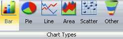
The Chart Types group is accessible from the Format tab on the Control Panel in Query Design or Interactive View for selecting chart types.
It provides an array of buttons for selecting the five most commonly used chart types. The button labeled Other accesses the entire charts library.
Five most common chart types
Report Creator output formats
- HTML (default for Reports and Charts)
- PDF(default for Compound Documents) and Active PDF
- Active Bar, Pie, Line, and Scatter Reports
- Active Flash
- Excel
- PowerPoint
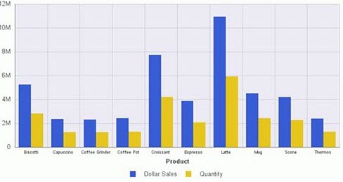
Bar charts
Use a bar chart to display the distribution of numerical data.
Basic bar chart
Bar chart types
|
Available bar chart types |
|
|---|---|
|
Vertical Clustered Bar |
Horizontal Clustered Bar |
|
Vertical Stacked Bar |
Horizontal Stacked Bar |
|
Vertical Dual-Axis Clustered Bar |
Horizontal Dual-Axis Clustered Bar |
|
Vertical Dual-Axis Stacked Bar |
Horizontal Dual-Axis Stacked Bar |
|
Vertical Bi-Polar Clustered Bar |
Horizontal Bi-Polar Clustered Bar |
|
Vertical Bi-Polar Stacked Bar |
Horizontal Bi-Polar Stacked Bar |
|
Vertical Percent Bar |
Horizontal Percent Bar |
|
Vertical Histogram |
Horizontal Histogram |
|
Vertical Waterfall |
Horizontal Waterfall |
|
Multi-3Y Bar |
Multi-4Y Bar |
|
Multi-5Y Bar |
Error Bar |
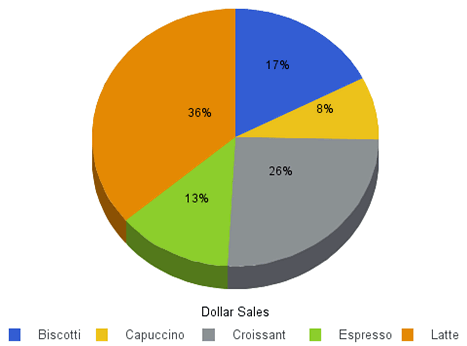
Pie charts
Pie charts emphasize where your data fits, in relation to a larger whole.
Basic Pie Chart
Pie chart types
|
Available pie chart types |
|
|---|---|
|
Multi Pie |
Multi Ring Pie |
|
Multi Proportional Pie |
Multi Proportional Ring Pie |
|
Single Pie |
Single Ring Pie |
|
Pie-Bar |
Ring Pie-Bar |
Line charts
Line charts emphasize the movement or trend of numerical data over time.
- Highs and lows, rapid or slow movement, or a tendency towards stability are all types of trends well suited to a line chart.
- You can also plot line charts with two or more scales to present a comparison of the same value, or set of values, in different time periods.
A radar line chart is available in the line chart category, and a radar area chart is available in the area chart category.
- Radar charts compare two or more data sets.
You can use axes or polygons to represent values in a star or spider configuration. Radar charts are essentially analogous to line charts, except that the scale wraps around.
- Radar charts work well with data that is cyclical, such as the months of a year.
Basic Line Chart

Line chart types
|
Available line chart types |
|
|---|---|
|
Vertical Absolute Line |
Horizontal Absolute Line |
|
Vertical Stacked Line |
Horizontal Stacked Line |
|
Vertical Dual-Axis Absolute Line |
Horizontal Dual-Axis Absolute Line |
|
Vertical Dual-Axis Stacked Line |
Horizontal Dual-Axis Stacked Line |
|
Vertical Bi-Polar Absolute Line |
Horizontal Bi-Polar Absolute Line |
|
Vertical Bi-Polar Stacked Line |
Horizontal Bi-Polar Stacked Line |
|
Vertical Percent Line |
Horizontal Percent Line |
|
Radar Line |
|
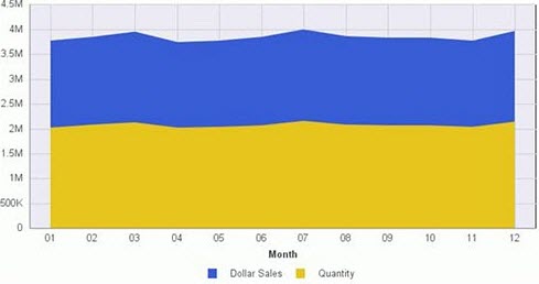
Area charts
- Area charts allow you to stack data on top of each other.
- Stacking allows you to highlight the relationship between data series, showing how some data series approach a second series.
Basic area chart
Area chart types
|
Available area chart types |
|
|---|---|
|
Vertical Absolute Area |
Horizontal Absolute Area |
|
Vertical Stacked Area |
Horizontal Stacked Area |
|
Vertical Bi-Polar Absolute Area |
Horizontal Bi-Polar Absolute Area |
|
Vertical Bi-Polar Stacked Area |
Horizontal Bi-Polar Stacked Area |
|
Vertical Percent Area |
Horizontal Percent Area |
|
Radar Area |
|
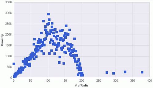
XY plot charts
Scatter charts share many of the characteristics of basic line charts. Plot data using variable scales on both axes. When you use a scatter chart, the data is plotted with a basic line pattern so that you can visualize the density of individual data values around particular points, or discern patterns in the data. A numeric X-axis, or sort field, always yields a scatter chart by default.
Scatter charts and line charts are distinguishable from one another only by virtue of their X-axis format. Line charts can appear without connecting lines, making them look like scatter charts, and scatter charts can appear with connecting lines, making them look like line charts.
Polar charts share characteristics with scatter charts. Only one column field is allowed, in the following order: X (degree) for the column field and Y (distance from the center) for the Across/By field.
Bubble charts display three dimensions, requiring three column fields representing X, Y, and Z data values, in that order. The size of the bubbles is proportional to the values that they represent.
Basic scatter chart
Scatter chart types
|
Available area chart types |
|
|---|---|
|
XY Scatter |
XY Polar |
|
Bubble |
|
3D charts
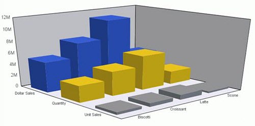
3D chart types
Available 3D chart types | |
|---|---|
3D Bar | 3D Pyramid |
3D Octagon | 3D Cylinder |
3D Floating Cubes | 3D Floating Pyramids |
3D Connected Series Area | 3D Connected Series Ribbon |
3D Connected Group Area | 3D Connected Group Ribbon |
3D Cone | 3D Sphere |
3D Surface | 3D Surface with Sides |
3D Smooth Surface | 3D Smooth Surface with Sides |
3D Honeycomb Surface | |
Additional chart types
Stock Charts
Stock chart types
Available Stock Chart Types | |
|---|---|
Stock Hi-Lo | Stock Hi-Lo with Volume |
Stock Hi-Lo Open-Close | Stock Hi-Lo Open-Close with Volume |
Open-Hi-Lo-Close Candle Stock | Open-Hi-Lo-Close Candle Stock with Volume |
Stock charts track the trend of a particular stock.
- Trading volume of the stock
- Its opening and closing values
- Its high and low values over a specific time period
The data is represented by sets of bars or lines.
Advanced chart types
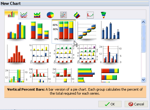
Report Creator provides a complete chart type library, which includes advanced chart types, as well as basic types. To access the full library, from the Format tab, Chart types group, click Other to open the New Chart dialog. Across the top of the dialog are eight tabs, depicted by icons. Each tab represents a chart type category. Hover your mouse over the icon to see a description of the category.
When a tab is selected, thumbnail images of the chart variations are displayed. In this example, the Vertical Percent Bar Chart type is selected. A description of the selected chart type is provided beneath the images.
In the category, click an image to display a detailed description of that chart type.
Selecting an Advanced Chart Type
In the following example, the 3D tab is selected (the third tab from the right). Underneath the tab, the 3D chart types supported by Report Creator are displayed as images. Within the images, the 3D Cylinder chart type is selected, and a description is displayed underneath.
Selecting a 3D Chart Type
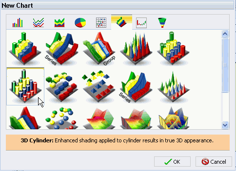
You can also hover over an image with your mouse to display the chart type name. If you are satisfied with your selection, click OK and run the report.
Some chart types require a certain number of data values or a certain type of data values.
If your data does not satisfy the requirements, the chart will not accurately represent the data.
Tip: If you are not familiar with a chart type, be sure to read the description carefully before finalizing your selection.
