ASR Dashboard
The ASR Dashboard collects visualizations of automatic speech recognition![]() Conversion of spoken words to interpretable text. (ASR) metrics such as the number of successful vs. unsuccessful ASR transactions, average transaction durations, and average latency. The dashboard represents data graphically but allows you to drill down to a more detailed, tabular view of the data from any of the dashboard's visualizations. Intended users are business sponsors and business owners.
Conversion of spoken words to interpretable text. (ASR) metrics such as the number of successful vs. unsuccessful ASR transactions, average transaction durations, and average latency. The dashboard represents data graphically but allows you to drill down to a more detailed, tabular view of the data from any of the dashboard's visualizations. Intended users are business sponsors and business owners.
In addition to the use of dashboard filters, Nuance Insights allows you to manipulate displayed data through several other means in order to better visualize information. Select from the following to learn more:
Visualizations
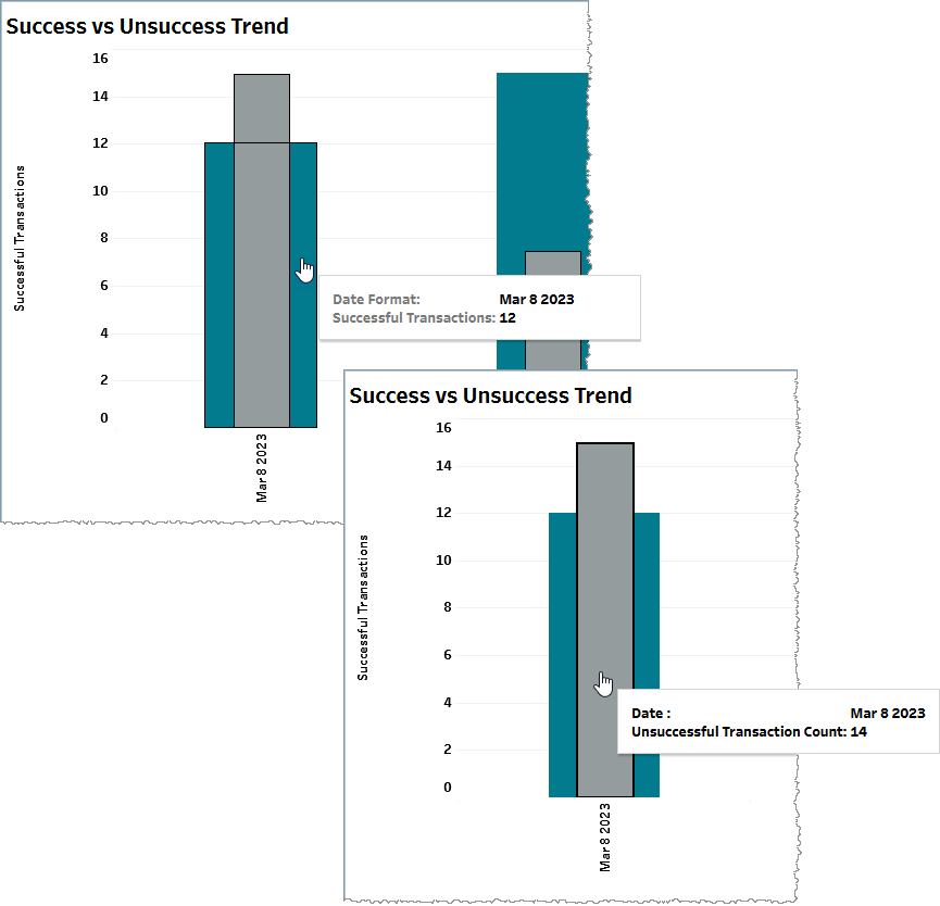
Success vs Unsuccess Trend
This graph plots the change in the number of successful and unsuccessful speech synthesis transactions over time. Transaction counts are raw (measured rather than calculated) metrics.
Note: In the context of ASR, a successful transaction is one that returns a payload. An unsuccessful transaction does not. Possible reasons for an unsuccessful ASR transaction include Canceled, No Match, Resources Unavailable, Bad Audio, No Audio, API Non-Adherence.
Use the Date Granularity slider to adjust the length of time for each data point during which transactions are counted. Use the Date slider to adjust the range of time spanned by the entire graph.
From this visualization, you may choose to drill down to the ASR Details report.
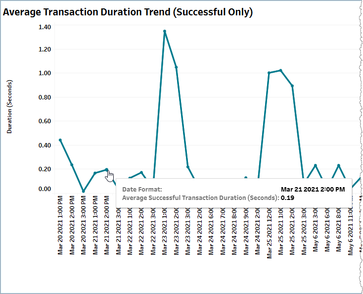
Average Transaction Duration Trend (Successful Only)
This graph plots the change over time in the average duration of successful ASR transactions for consecutive blocks of time, each with a duration defined by the Date Granularity slider. In the example, below, the Date Granularity slider is set to Hour. The average duration in seconds for successful transactions on March 21st, 2021 between 2pm and 3pm is 0.19 seconds.
Note: Be aware that although this is a line graph with time-based x-coordinates spaced at regular intervals (determined by the Date Granularity slider), the slopes of lines between data points may be unreliable if there are any data gaps corresponding to one or more blocks of time. In such a case, this graph skips the missing data slot and goes to the next valid data value. For example, if the Date Granularity slider is set to Hour and there is data for 1:00pm and 3:00pm on a given day but not for 2:00pm, the graph renders the data points for 1:00pm and 3:00pm immediately beside each other with a line drawn between them.
From this visualization, you may choose to drill down to the ASR Details report.
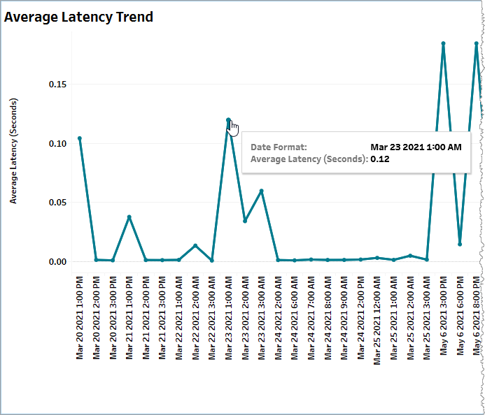
Average Latency Trend
This graph plots the change over time in the average latency for consecutive blocks of time, each with a duration defined by the Date Granularity slider. In the example, below, the Date Granularity slider is set to Hour. The average latency in seconds on March 23rd, 2021 between 1am and 2am is 0.12 seconds.
Note: Be aware that although this is a line graph with time-based x-coordinates spaced at regular intervals (determined by the Date Granularity slider), the slopes of lines between data points may be unreliable if there are any data gaps corresponding to one or more blocks of time. In such a case, this graph skips the missing data slot and goes to the next valid data value. For example, if the Date Granularity slider is set to Hour and there is data for 1:00pm and 3:00pm on a given day but not for 2:00pm, the graph renders the data points for 1:00pm and 3:00pm immediately beside each other with a line drawn between them.
From this visualization, you may choose to drill down to the ASR Details report.
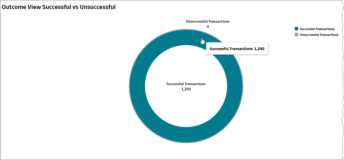
Outcome View Successful vs Unsuccessful
This donut chart visualizes the proportional distribution of ASR transaction outcomes, split out into successful and unsuccessful categories. Mouse over any part of the chart for a tooltip giving a transaction raw count.
From this visualization, you may choose to drill down to the ASR Details report.
Error Volume
This pie chart visualizes the proportional distribution of error volume, split out into the raw counts of client and server errors respectively. Mouse over any part of the chart for a tooltip with relevant information.
From this visualization, you may choose to drill down to the ASR Details report.
Average Error Duration (Seconds)
This pie chart visualizes the proportional distribution of aggregate error duration, split out into the raw counts of client and server errors respectively. Mouse over any part of the chart for a tooltip with relevant information.
From this visualization, you may choose to drill down to the ASR Details report.
Filtering
The filters in this section allow you to reduce the volume of displayed data on the dashboard.
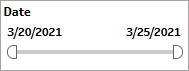
Date
The Date filter is a slider with two moveable sides. By narrowing the date range, you display only data falling within the range.
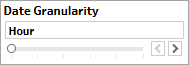
Date Granularity
The Date Granularity filter allows you to adjust the reported data granularity described by the trend lines. Drag the slider horizontally to adjust the granularity of reported data. Alternatively, you can use the left  and right
  arrow buttons to move the slider incrementally.
Appid
This filter selectively reduces the volume of data displayed based on application ID. The filter reduces data by including or excluding one or several applications. Specify one or more applications from the list as required.
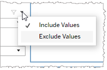
Click Include values to display only those data possessing the selected values. All other data are hidden from the visualization.
Click Exclude values to display only those data that do not possess the selected values.
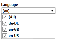
Language
This filter selectively reduces the volume of data displayed based on language. The filter reduces data by including or excluding one or several languages.
Specify one or more languages from the list as required.
Click Include values to display only those data possessing the selected values. All other data are hidden from the visualization.
Click Exclude values to display only those data that do not possess the selected values.
Org ID
This filter selectively reduces the volume of data displayed based on org ID. The filter reduces data by including or excluding one or several IDs.
Specify one or more org IDs from the list as required.
Click Include values to display only those data possessing the selected values. All other data are hidden from the visualization.
Click Exclude values to display only those data that do not possess the selected values.
