Data Access Node Trend
This report displays the same data visualized in the Data Access Node report but as each data point trends over time. Both the Data Access Node report and this report graphically visualize the relative proportions of database states and their status codes broken out by channel. This report represents the percentage of lookups, for a given database state, that end in Success, Failure, or Unknown. Each bar corresponds to a raw count of instances in which a particular status code occurred for a particular database state.
In addition to the use of report filters, Nuance Insights allows you to manipulate displayed data through several other means in order to better visualize information. Select from the following to learn more:
Visualizations
Data Access Node Trend
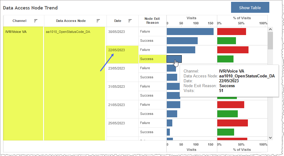
You can view the data for this section either as a graphical visualization or in a text-only table. Both formats identify channel and data access node on the left. The Visits metric compares the raw counts of visits of individual data access nodes to one another. If you choose to use the graphical visualization, the Visits metric, as a quantity, is communicated through the length of the bar.
Note: To see the data from the graphical visualization displayed in an alternative, textual way, click Show Table. To toggle back to the graphical view, click Show Graph.
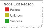
In the example below, the aa1010_OpenStatusCode_DA data access node in the channel IVR/Voice VA, had 51 visits with a Node Exit Reason of Success for data time-stamped 22/05/2023.
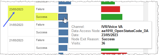
The following day's data (23/05/2023) shows a decrease to only 36 visits for the same data access node, channel, and having a Node Exit Reason of Success.
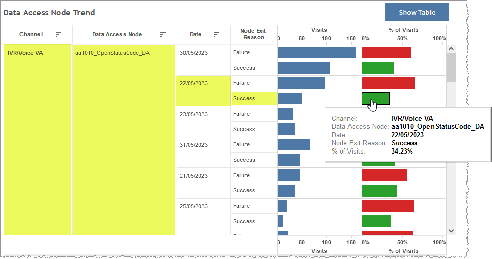
The % of Visits (right) side of the graph visualizes the relative distribution of exit reasons for a given data access node for a given time increment (either a day or hour, depending on your choice of summarization data).
In the example below, of all visits with a data access node of aa1010_OpenStatusCode_DA in the channel IVR/Voice VA for data time-stamped 22/05/2023, 34.23% had an exit reason of Success. Compare the bar length of this calculated metric to other bars with the same exit reason to draw conclusions about how this metric trends over time.
The alternative, tabular visualization of the same summary data communicates through text only.
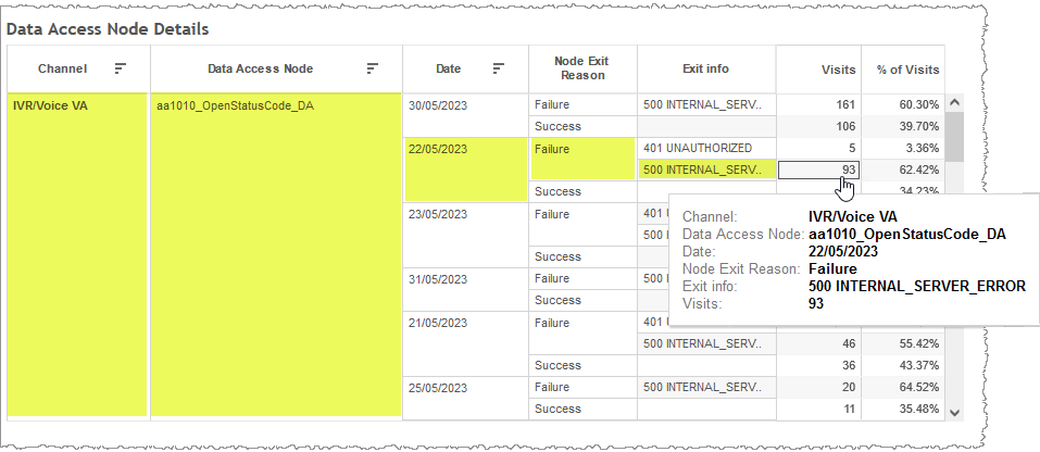
Data Access Node Details
This table presents a more detailed description of data access node information than what is visible in the Summary visualization. The Details table makes individual exit information strings of exit reasons the active dimension and reports visit counts and percent of visits as metrics to that dimension.
In the example below, of all visits with a data access node of aa1010_OpenStatusCode_DA in the channel IVR/Voice VA for data time-stamped 22/05/2023, having an exit reason of Failure and Exit info code of 500 INTERNAL_SERVER_ERROR, there were 93 visits which, when compared to all visits for this data access node with the same channel and for the same day, is 62.42% of all visits.
Filters
Increase the specificity of your view's reporting by applying filters to the data.
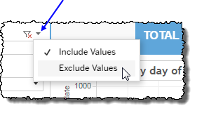
Clicking Include values displays only those data possessing the selected values. All other data are hidden from the visualization.
By contrast, clicking Exclude values displays only those data that do not possess the selected values.
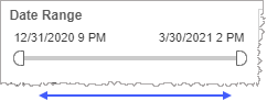
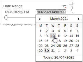
Date Range
The Date Range filter is a slider with two moveable sides. By narrowing the date range, you display only data falling within the range.
In addition to the slider, the filter allows you to specify start and end points to the range by time of day as well as by date by clicking the Start and End regions, clicking a second time on the time of day, and then manually entering a new time of day.
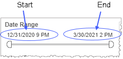
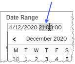
To select a date with the date picker, click the Start region to pick a date from the date picker widget. Do the same with the End region.
State
Reduce the volume of reported data by specifying which state (data access node) to include to the exclusion of all other unselected states.
Selecting All effectively negates the filtering effect of this filter. Clearing the All checkbox filters out all states. This is particularly useful if you want to select just a few states. By clearing the All checkbox, and then selecting the few you would like to include, you avoid the step of individually having to clear each of the individual checkboxes of the states you do not want to include.
Channel
By choosing one or more channels from the list, you refine your displayed data-set by including data from only those channels matching the selection.
- Select all available values by selecting All.
- Select only one value by first clearing the All checkbox, and then selecting the value whose data you would like to see visualized.
-
Select several values by doing one of the following:
- Clear the All checkbox, and then select the values whose data you would like to see visualized.
- Select the All checkbox and then clear values whose data you would NOT like to see visualized.
Node Exit Reason legend
Use this tool to highlight data having one or several specified node exit reasons.
Custom filters
This report accommodates customizable filters.
Customizable filters narrow the scope of the reported dataset by including or excluding data with identifiable attributes. These attributes may be about the conversation itself or about an event that may have happened during the conversation.
For more information about how to add customized filters to your view, contact your Nuance Professional Services representative.
Note: If you would like to modify this or any report, Nuance Communications, Inc. recommends you contact Nuance Professional Services.
