Performance By Final Intent
On a per channel basis, this report visualizes performance of interpreted final intents in terms of a user-specified metric.
In addition to the use of report filters, Nuance Insights allows you to manipulate displayed data through several other means in order to better visualize information. Select from the following to learn more:
Visualizations
Performance by Final Intent graph
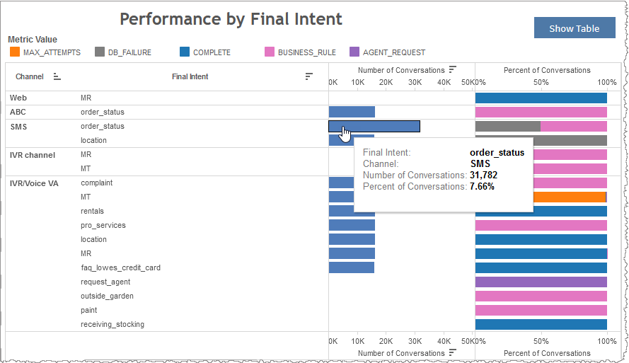
You can view the data for this section either as a stacked graph or in a text-only table. Both formats break out the quantified metrics first by channel and then by final intent. The Number of Conversations metric is the raw count of conversations for a given final intent in a given channel. If you choose to use the graphical visualization, the Number of Conversations bar graph visualizes the relative magnitudes of conversation counts with bar length. The table lists the raw count in text format in the Number of Conversations column.
Note: To see the data from the graphical visualization displayed in an alternative, textual way, click Show Table. To toggle back to the graphical view, click Show Graph.
In the graph, each bar's tool tip quantifies the percent distribution of that intent's raw count of conversations compared to the overall number of conversations for all final intents across all channels.
In the example below, conversations for a given final intent of order_status and belonging to the channel SMS, had a raw count of 31,782, which, when compared to the overall number of conversations across all final intents and channels, yielded a percent distribution of 7.66%.
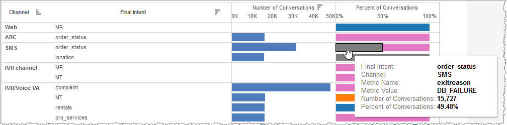
In both the graph and table, Percent of Conversations breaks down conversations having a given final intent within a channel by attribute value. In the graph, the segments of each bar contrast the proportional weighting of attribute values to one another, keeping final intent and channel constant. In the table, the weighting of individual attribute values (keeping final intent and channel constant) is represented as a percent of the conversations having the same final intent and channel and having any attribute value.
Note: To see the data from the graphical visualization displayed in an alternative, textual way, click Show Table. To toggle back to the graphical view, click Show Graph.
In the example below, there were 15,727 conversations with a final intent of order_status , belonging to the channel SMS, and having a metric value of DB_FAILURE, which, when compared to the overall number of conversations having the same final intent and channel but allowing for any metric value, constituted 49.48%.
Performance Metric Over Time graph
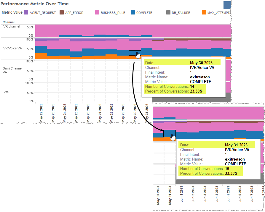
You can view the data for this section either as a stacked graph or in a text-only table. This section maps the change over time of the relative weighting of conversations having a given attribute value for a user-specified metric within a given channel. In the graph, within each bar, a comparison of segments to one another is a comparison of the proportional weighting of different attribute values to one another, keeping metric and channel constant. In the table, the weighting of individual attribute values is represented as a percent of the conversations having the same metric and channel but having any attribute value.
Note: To see the data from the graphical visualization displayed in an alternative, textual way, click Show Table. To toggle back to the graphical view, click Show Graph.
In the example below, on May 30, 2023, there were 14 conversations with a metric value of COMPLETE and having a metric of exitreason from the IVR/Voice VA channel. This constituted 23.33% of all conversations on that day having ANY metric value but keeping metric and channel constant. The next chronological data point is May 31, 2023, and on that day the number of conversations with a metric value of COMPLETE with the same metric and channel increased to 16, which constituted 33.33% of all conversations with the same metric and channel on that day.
Note: Be aware that if you compare two percentage values from two data points (two discrete periods of time), the total number of conversations also may be different which changes the denominator of the calculated percent value. If the total number of conversations changes across data points, a rise in percent, for example, may not correspond to a proportional rise in the number of conversations or even to a rise at all.
Filters
Increase the specificity of your view's reporting by applying filters to the data.
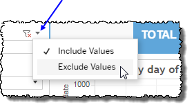
Clicking Include values displays only those data possessing the selected values. All other data are hidden from the visualization.
By contrast, clicking Exclude values displays only those data that do not possess the selected values.
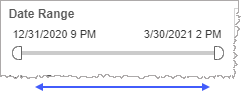
Date Range
The Date Range filter is a slider with two moveable sides. By narrowing the date range, you display only data falling within the range.
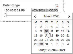
In addition to the slider, the filter allows you to specify start and end points to the range by time of day as well as by date by clicking the Start and End regions, clicking a second time on the time of day, and then manually entering a new time of day.
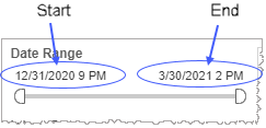
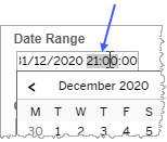
To select a date with the date picker, click the Start region to pick a date from the date picker widget. Do the same with the End region.
Date Granularity
The Date Granularity filter allows you to adjust the reported data granularity described by the trend lines. Drag the slider horizontally to adjust the granularity of reported data. Alternatively, you can use the left  and right
  arrow buttons to move the slider incrementally.
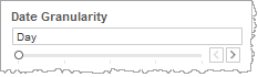
Note: If you choose to draw from hourly instead of daily summarization data, the Date Granularity filter will no longer be visible.
Final Intent
By choosing one or more final intents from the list, you refine your displayed data-set by including data from only those final intents matching the selection.
- Select all available values by selecting All.
- Select only one value by first clearing the All checkbox, and then selecting the value whose data you would like to see visualized.
-
Select several values by doing one of the following:
- Clear the All checkbox, and then select the values whose data you would like to see visualized.
- Select the All checkbox and then clear values whose data you would NOT like to see visualized.
Channel
By choosing one or more channels from the list, you refine your displayed data-set by including data from only those channels matching the selection.
- Select all available values by selecting All.
- Select only one value by first clearing the All checkbox, and then selecting the value whose data you would like to see visualized.
-
Select several values by doing one of the following:
- Clear the All checkbox, and then select the values whose data you would like to see visualized.
- Select the All checkbox and then clear values whose data you would NOT like to see visualized.
Custom filters
This report accommodates customizable filters.
Customizable filters narrow the scope of the reported dataset by including or excluding data with identifiable attributes. These attributes may be about the session or about an event that may have happened during the session.
For more information about how to add customized filters to your view, contact your Nuance Professional Services representative.
Note: If you would like to modify this or any report, Nuance Communications, Inc. recommends you contact Nuance Professional Services.
