Self Service and Outcome Detail
On a per channel basis, this report visualizes the relative proportion of conversations in the data with Self Service metrics and with the various conversational outcomes.
In addition to the use of report filters, Nuance Insights allows you to manipulate displayed data through several other means in order to better visualize information. Select from the following to learn more:
Visualizations
Caller Self Service
You can view the data for this section either as a stacked graph or in a text-only table. Both formats represent the proportional weighting of conversations matching self-service detail values (see table, below) trended over time in configured time increments. The graph represents proportion as a percent of the total number of conversations in a given time increment. The x-axis of the chart reflects the date range configured in the Date filter. Use the Daily/Hourly toggle buttons and the Date Granularity slider to configure the duration of each time increment in the x-axis. Additionally, you can configure the graph to visualize different levels of self-service detail as a stacked trending graph with each stacked segment representing a different grouping of self-service metrics with given values.
There are three levels of self-service detail, each having several possible profiles:
| Self-Service Detail | Possible self-service profiles | Description |
|---|---|---|
| Least Detail | Self Service Completed |
All conversations where self-service completed. |
| Moderate Detail |
|
Containment status of conversations where self-service completed. |
| Most Detail |
|
|
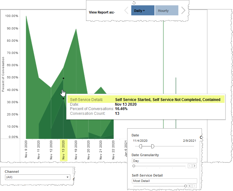
In the example, below, the Graph visualization draws upon daily summarization data from the date range of November 4th, 2020 to February 9th, 2021 from all channels. The user configured the Date Granularity filter to Day which sets each x-axis data point duration to a single day. The user also configured the Self-Service Detail filter to Most Detail, which divides each data point into four possible self-service metric combinations (see Most Detail row in table, above). The graph represents the proportional weighting of each of these self-service metric combinations as a single segment in a stacked data point with each segment color-coded and representing one of the combinations. Below, the number of conversations, from the filtered data pool on November 13th, 2020, having started self-service but not completed it and also being contained, was 13, which represent represents 16.46% of all conversations on that day.
Note: If you select Show Table in this section, the table communicates the same information in a text-only display.
Conversation Outcomes
You can view the data for this section either as a stacked graph or in a text-only table. Both formats represent the proportional weighting of conversations matching outcome detail values (see table, below) trended over time in configured time increments. The graph represents proportion as a percent of the total number of conversations in a given time increment. The x-axis of the chart reflects the date range configured in the Date filter. Use the Daily/Hourly toggle buttons and the Date Granularity slider to configure the duration of each time increment in the x-axis. Additionally, you can configure the graph to visualize different levels of outcome detail as a stacked trending graph with each stacked segment representing a different grouping of outcome metrics with given values.
Note: In the case of conversation outcomes, all conversations have an outcome value. This is why for every x-axis data point, the stacked segments always add up to 100%.
There are three levels of conversation outcome detail, each having several possible outcome profiles:
| Outcome Detail | Possible outcome profiles | Description |
|---|---|---|
| Least Detail |
|
Status of either having been contained or transferred to an agent. |
| Moderate Detail |
|
|
| Most Detail |
|
|
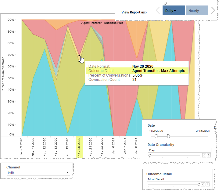
In the example, below, the Graph visualization draws upon daily summarization data from the date range of November 2nd, 2020 to February 15th, 2021 from all channels. The user configured the Date Granularity filter to Day which sets each x-axis data point duration to a single day. The user also configured the Outcome Detail filter to Most Detail, which displays conversations that transferred to an agent and further breaks this grouping down into the type of agent transfer. Additionally, the Most Detail granularity setting displays in discrete segments all containment types and further distinguishes user-exited contained conversations into completed and not completed self-service segments (see Most Detail row in table, above). This graph represents the proportional weighting of each of these outcome profiles as a single segment in a stacked data point with each segment color-coded and representing one of the profiles. Below, the number of conversations, from the filtered data pool on November 20th, 2020, having transferred to an agent because the Max Attempts threshold was reached, was 21, which represent represents 5.05% of all conversations on that day.
Note: If you select Show Table in this section, the table communicates the same information in a text-only display.
Filters
Increase the specificity of your view's reporting by applying filters to the data.
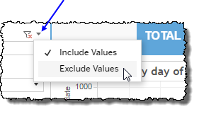
Clicking Include values displays only those data possessing the selected values. All other data are hidden from the visualization.
By contrast, clicking Exclude values displays only those data that do not possess the selected values.
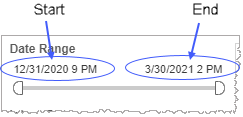
Date Range
The Date Range filter is a slider with two moveable sides. By narrowing the date range, you display only data falling within the range.
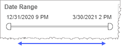
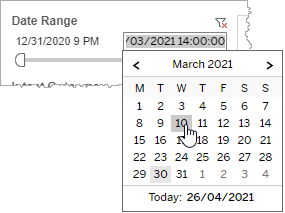
In addition to the slider, the filter allows you to specify start and end points to the range by time of day as well as by date by clicking the Start and End regions, clicking a second time on the time of day, and then manually entering a new time of day.
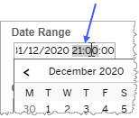
To select a date with the date picker, click the Start region to pick a date from the date picker widget. Do the same with the End region.
Date Granularity
The Date Granularity filter allows you to adjust the reported data granularity described by the trend lines. Drag the slider horizontally to adjust the granularity of reported data. Alternatively, you can use the left  and right
  arrow buttons to move the slider incrementally.
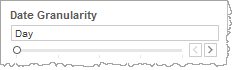
Note: If you choose to draw from hourly instead of daily summarization data, the Date Granularity filter will no longer be visible.
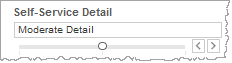
Self-Service Detail slider
The Self-Service Detail filter allows you to select from among three levels of granularity for self-service information. the reported data granularity described by the trend lines. Drag the slider horizontally to adjust the granularity of reported data. Alternatively, you can use the left and right arrow buttons to move the slider incrementally.
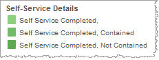
Self-Service Details highlight tool
This tool allows you to highlight only conversations having selected self-service detail profiles from the visualized data. Click on a single self-service detail profile in the color-coded list or ctrl-click multiple profiles to highlight.
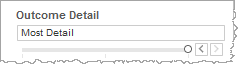
Outcome Detail slider
The Date Granularity filter allows you to adjust the reported data granularity described by the trend lines. Drag the slider horizontally to adjust the granularity of reported data. Alternatively, you can use the left and right arrow buttons to move the slider incrementally.
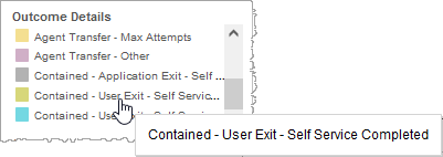
Outcome Details highlight tool
This tool allows you to highlight only conversations having selected outcome profiles from the visualized data. Click on a single outcome profile in the color-coded list or ctrl-click multiple profiles to highlight.
Channel
By choosing one or more channels from the list, you refine your displayed data-set by including data from only those channels matching the selection.
- Select all available values by selecting All.
- Select only one value by first clearing the All checkbox, and then selecting the value whose data you would like to see visualized.
-
Select several values by doing one of the following:
- Clear the All checkbox, and then select the values whose data you would like to see visualized.
- Select the All checkbox and then clear values whose data you would NOT like to see visualized.
Custom filters
This report accommodates customizable filters.
Customizable filters narrow the scope of the reported dataset by including or excluding data with identifiable attributes. These attributes may be about the conversation itself or about an event that may have happened during the conversation.
For more information about how to add customized filters to your view, contact your Nuance Professional Services representative.
Note: If you would like to modify this or any report, Nuance Communications, Inc. recommends you contact Nuance Professional Services.
