Custom chart features
Presentation of data on a chart is successful when it communicates the message that is intended. Report Creator helps you meet the needs of your audience and convey your message by providing numerous chart features.
Custom chart features
-
Customize labels identifying displayed data
You can use the following custom features when creating charts with a compatible output format. First create the chart, then modify its features.
These custom chart features are only available to charts that are being output in HTML, PDF, Excel 2000, or PowerPoint formats.
Chart customization options:
| Task | Information |
|---|---|
| Add a page header and page footer. | See Headers and Footers. |
| Add a trend line to a chart. | See Trend Lines. |
| Add annotations to a chart. | See Annotations. |
| Add data labels to a chart. | See Data Labels. |
| Add reference lines to a chart. | See Reference Lines. |
| Change the display of grid lines on a chart. | See Grid Lines. |
| Customize the display of axis labels on a chart. | See Axis Labels. |
| Customize the display of legend labels on a chart. | See Legend Labels. |
| Customize the display of markers on line and scatter chart types. | See Custom Markers. |
| Display line charts using smooth lines. | See Smooth Lines. |
| Rotate the orientation of a chart. | See Rotated Charts. |
Reference lines
Reference lines draw attention to specific data locations on a chart.
You can add up to three horizontal (X-axis) and three vertical (Y-axis) reference lines to a chart.
- In the Format tab, Features group, click Reference.
- In the drop-down menu that opens, click one of the following:
- Add Reference Line to Y-Axis
- Add Reference Line to X-Axis
Reference line dialog:
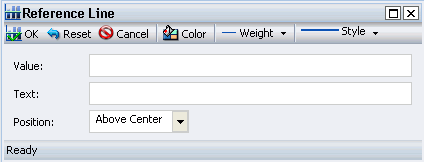
- In the Value field, type the specific X-axis value or Y-axis value that indicates where to display the reference line. (This must be an absolute value. Formulae are not supported.)
- In the Text field, type the desired text for the reference line.
- In the Position menu, click the desired position of the reference line on the chart and select a choice.
- Set the desired Color, Weight, and Style values for the reference line.
|
Position Choices:
|
Weight Choices:
|
Style Choices:
|
- Click Color to open the Color dialog and select a standard or custom color as described in Color Selection.
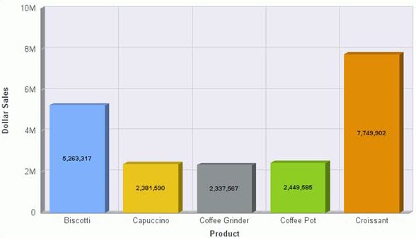
Sample Y-Axis Reference Line
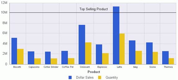
The reference line was added by typing 10000000 in the Value field and Top Selling Product in the Text field.
The reference line uses the default Above Center for Position.
Annotations
Annotations are explanatory notes or comments.
You can add up to eight annotations to a chart.
- In the Format tab, Features group, click Annotate.
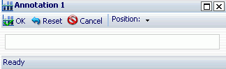
- In the drop-down menu that opens, click Add an annotation to open the dialog.
- In the text input field, type the desired text for the annotation.
- In the Position drop-down menu, click the desired position for the annotation on the chart.
|
|
Sample Annotated Bar Chart
- Click OK and run the report to add it to the chart.
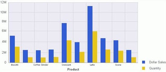
Grid lines
You can add O1 Minor Gridlines and Y1 Minor Gridlines to the O1 Major Gridlines and Y1 Major Gridlines that are displayed by default on a chart.
Sample Bar Chart, Grid Lines
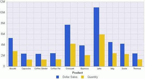
- In the Format tab, Features group, click Grid Lines.
- In the drop-down menu, select or deselect any of the grid line options.
- O1 Minor Gridlines and Y1 Minor Gridlines options are deselected by default
- O1 Major Gridlines and Y1 Major Gridlines options are selected by default.
- You can deselect any of the grid lines, including the default grid lines to remove them from the chart.
- Run the report
- The selected grid lines are added to the chart, and any deselected grid lines are removed.
- O1 Minor Gridlines and Y1 Minor Gridlines.
- The default grid lines
- O1 Major Gridlines and Y1 Major Gridlines
Smooth lines
Do one of the following:
- In the Format tab, Chart Types group, click Line.
- In any type of chart, click the numeric measure field in the Query Design pane.
- In the Series tab, Properties group, click Type, and click Line. (Use this technique to create a combination chart that displays different types of chart data (bar or line) for different measurement fields.)
- In the series tab, Line group, click Smooth Line.
Sample Chart with Smooth Lines
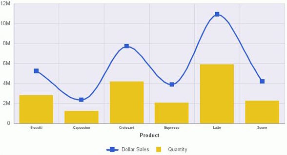
The Line type and smooth lines were applied to the Dollar Sales field. The Bar type was applied to the Quantity field.
Trend lines
A trend line is a line that is drawn over the plot area of a chart to show the pattern of the data points. The pattern reveals a statistical trend.
- In the Series tab, Properties group, click Trend Lines.
- In the Trend Line drop-down menu that opens, click the type of trend line that you want to display.
- Run the report to include the selected trend line option.
The mathematical equation for the option is displayed above the trend line.
Trend Line options:
|
|
Sample Chart with Linear Trend Lines
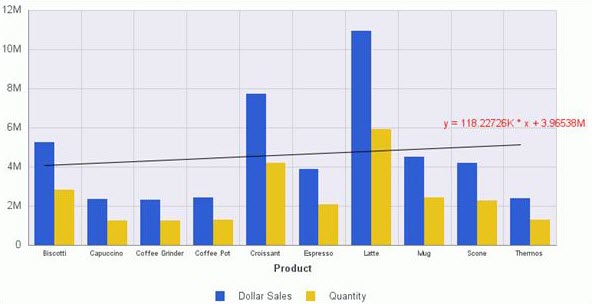
Tip: Optionally, to display the mathematical equation for the selected trend line option, in the Series tab, Properties group, click Equation.
Axis labels
You can display, hide, stagger, and rotate both the X-Axis (O1) and Y-Axis (Y1) labels by making selections in the Axes drop-down menu.
- In the Format tab, Labels group, click Axes.
- In the drop-down menu, select or deselect any of the axis display options:
|
|
- The two Rotate options provide a choice of None (default), 45, 90, and 270 degrees. (You can repeat the process to select or deselect other axis display options.)
- When you run the report, the selected axis display options appear on the chart.
Bar Chart, Rotated O1 and Y1 Axis Labels, 45 Degrees
Legend labels
When there are two or more measure fields in a report, titles of those fields are automatically included in a legend.
- Specify the position or orientation of a legend on a chart or suppress the display of the legend.
- In the Format tab, Labels group, click Legend.
- In the drop-down menu that opens select or deselect Show Legend.
- Highlight Legend Position and select an option.
- Highlight Legend Orientation and click one of the available options.
- Auto (default)
- Vertical
- Horizontal
- Repeat the process to select or deselect other legend display options.
- Run the report to include the selected legend options.
Legend label options:
|
|
|
Vertical chart, right bottom legend position
Data labels
You can display data labels (values) on a chart in a variety of ways.
- In the Series tab, Properties group, click Data Labels to enable label display.
- In the Properties group, click Data Position. In the drop-down menu that opens, select one of the following data label display options:
- Above (default)
- On top edge
- Below top edge
- Center
- Base
- Run the report to include the selected data label option.
Sample centered data labels:
Custom markers
By default, data markers are automatically displayed on line and scatter chart types. If a line or scatter chart type contains more than one measure field, markers are also displayed in the legend.
You can choose the shape of the data and legend markers.
- In the Series tab, Select group, on the drop-down list click the Series (field) to which the marker will apply.
- In the Line group, click Marker.
- In the marker drop-down menu that opens, click the desired marker shape.
Custom markers options:
|
|
|
|
- Repeat as needed to select different markers for other series in the report.
- Run the report to included the selected marker shapes.
The image demonstrates the Square marker for Dollar Sales, and the Circle marker for Quantity.
The markers are used to display points of data on the line chart and to identify the data that is displayed.
Sample of customized markers
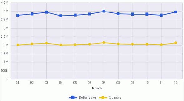
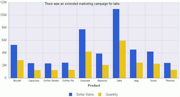
Chart headers and footers
Headers and footers enhance visual appeal, supply context and key information about a chart, such as its purpose, audience, and author.
This is an optional feature that extends capabilities when working with Page Headers and Footers.
Options for adding headers and footers
- With your chart open, on the Home tab, Report group, click Header and Footer.
- Or drop-down the menu by clicking the arrow next to the button.
- Selecting an option opens the Header and Footer dialog where your selection is active.
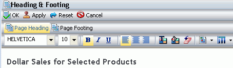
- Click inside the design area of the dialog and type the text for the page header.
- Using the custom options, apply styling to the page header text.
- Apply saves your changes without closing the dialog; OK saves and closes.
- Run the report.
- To make changes to either the page header or page footer, return to design view.
- Right-click the header or footer, and click Edit from the drop-down menu.
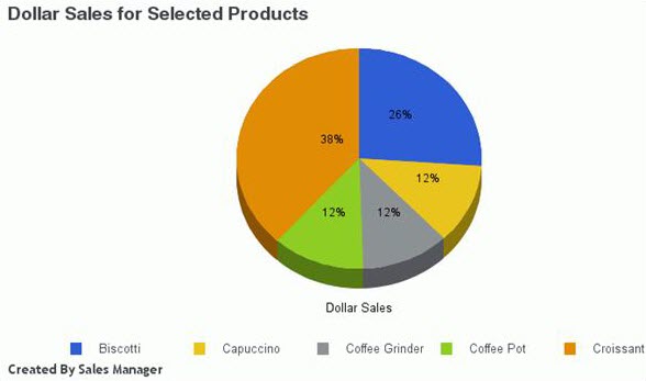
Sample chart with header and footer
Control chart headers and footers
Control the way page headers and footers are rendered at run time.
Tip: Your choice for a page header also applies to the page footer, and vice versa.
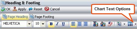
- With the chart open, on the Home tab, Report group, click Header and Footer to open the dialog
- Click the Text options icon on the style ribbon. A drop-down menu opens, with two options for rendering the page header and footer.
- Create Header and Footer as text renders the header and footer as text elements that are separate from the chart image. This is the default value.
- Embed Header and Footer in the chart renders the header and footer text as part of the chart image.
Text options for chart
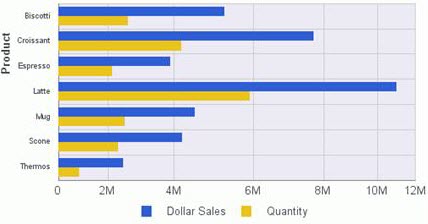
Rotated charts
Rotate the chart 90 degrees clockwise.
- In the Format tab, Features group, click Rotate.
- Run the report.
Sample rotated chart