The Resources panel
The Resources Panel displays the Data pane in the upper half of the panel and the Query Design pane, with both a filter area and a query area, in the lower half of the panel by default. See Add Data Source Fields for detailed instructions on using the Resources panel to add and manipulate fields in your templates.
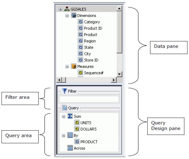
The Data pane, which contains all the fields from the selected data sources, is always displayed. You can manually adjust the size of the Resources Panel and Results Panel by clicking and dragging the border between the two panels in either direction.
In the Resources panel, each field has an image associated with it. The following table displays each image and describes what it represents.
The Query Design pane is made up of the filter area and the query area. In Query Design view, the Resources Panel displays the Data pane only. The Query Design pane is expanded and shows in the Results panel.
Data Icons
|
Icon |
Type |
Icon |
Type |
|---|---|---|---|
|
|
|
Dimension Segment |
|
|
|
Measure Segment |
|
Locked Segment |
|
|
|
||
|
|
Index Field |
|
Blob or Compute Field |
|
|
|
Date or Date and Time Field |
|
|
|
Numeric Field |
|
Calculated Date Field |
|
|
Calculated Numeric Field |
|
Calculated Other Field |
|
|
Calculated Text Field |
Query Design Filter pane
The filter area lists all simple and advanced filters that have been created and saved in this template. See Data Filters.
Note: The Filter area displays all created filters, both active (included) and inactive (excluded). Include and exclude filters using buttons in the Field tab, Query group.Query 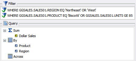
Query Design query pane
|
|
The Query area includes all available field containers for the Query type.
More complex charts that require additional data dimensions have alternative field containers.
