Q and A Node Input Mode
The Q and A Node Input Mode report displays a relative distribution of input modes for each Q and A node, visualized on a per channel basis.
You can filter by adjusting the time period displayed as well as by selectively including and excluding data associated with some or all Q and A nodes. Up to ten customizable filters may be available. These filters depend upon data from AFO (after-the-fact-outcome) files.
In addition to the use of report filters, Nuance Insights allows you to manipulate displayed data through several other means in order to better visualize information. Select from the following to learn more:
Visualizations
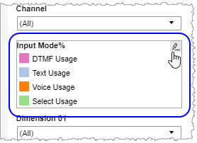
Main Input Mode section
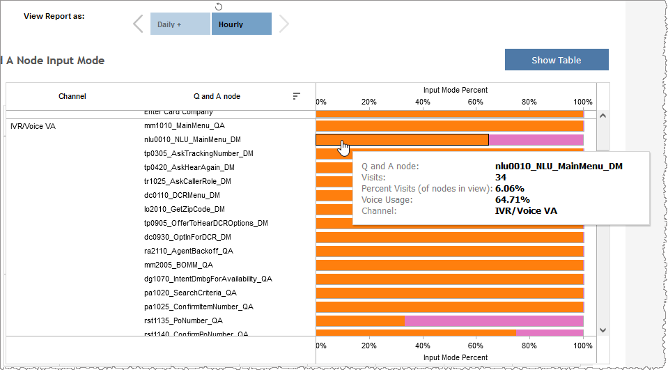
You can view the data for this section either as a graphical visualization or in a text-only table. Both formats show a percentage distribution of input modes for each Q and A node, on a per channel basis. The percentages are calculated out of the total of inputs the Q and A node processed, including both inputs that resulted in a retry and inputs that resulted in a successful exit with intent.
In the graph, the relative weighting of conversations having a given input mode, keeping Q and A node and channel constant, is represented by the length of a color-coded bar segment. The table visualizes this data, including the percent weighting of individual input modes per Q and A node, in discrete columns.
Note: To see the data from the graphical visualization displayed in an alternative, textual way, click Show Table. To toggle back to the graphical view, click Show Graph.
In the example below, of all input modes with a Q and A node of nlu0010_NLU_MainMenu_DM belonging to the channel IVR/Voice VA, 64.71% of them had an input mode of Voice Usage. This represents 6.06% of all visits of nodes in view.
Input Mode Over Time
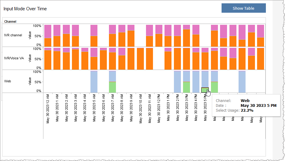
You can view the data for this section either as a graphical visualization or in a text-only table. Both formats show the contribution of individual input modes compared to the sum of all input modes for a given data point within a given channel. The graph visualizes the relative weighting of input modes for a given channel as a color-coded bar segment. The segment's height compared to the full height of the bar is a graphical representation of the relative weighting of conversations with a given input mode within the channel at a given data point compared to conversations with a different input mode keeping all other parameters constant. The table visualizes this data, including the percent weighting of individual input modes per data point in a channel, in discrete columns.
Note: To see the data from the graphical visualization displayed in an alternative, textual way, click Show Table. To toggle back to the graphical view, click Show Graph.
In the example, below, the Select Usage input mode contribution on May 30th, 2023 in the Web channel was 22.2%.
Note: It is important to note that in this graph, the denominator of the ratio used to calculate the relative input mode contribution is the sum of only those input modes belonging to the given channel. This ratio does not span channels.
Filters
Increase the specificity of your view's reporting by applying filters to the data.
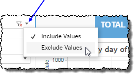
Clicking Include values displays only those data possessing the selected values. All other data are hidden from the visualization.
By contrast, clicking Exclude values displays only those data that do not possess the selected values.
Date Range
The Date Range filter is a slider with two moveable sides. By narrowing the date range, you display only data falling within the range.
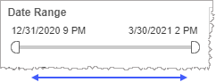
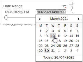
In addition to the slider, the filter allows you to specify start and end points to the range by time of day as well as by date by clicking the Start and End regions, clicking a second time on the time of day, and then manually entering a new time of day.
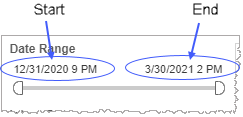
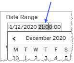
To select a date with the date picker, click the Start region to pick a date from the date picker widget. Do the same with the End region.
Q and A node
Reduce the volume of reported data by specifying which Q and A nodes to include (to the exclusion of all other unselected Q and A nodes).
Selecting All effectively negates the filtering effect of this filter. Clearing the All checkbox filters out all Q and A nodes. This is particularly useful if you want to select just a few Q and A nodes. By clearing the All checkbox, and then selecting the few you would like to include, you avoid the step of individually having to clear each of the individual checkboxes of the Q and A nodes you do not want to include.
Channel
By choosing one or more channels from the list, you refine your displayed data-set by including data from only those channels matching the selection.
- Select all available values by selecting All.
- Select only one value by first clearing the All checkbox, and then selecting the value whose data you would like to see visualized.
-
Select several values by doing one of the following:
- Clear the All checkbox, and then select the values whose data you would like to see visualized.
- Select the All checkbox and then clear values whose data you would NOT like to see visualized.
Input Mode highlight tool
Use this filter to highlight data having one or several specified
- In the highlight tool, mouse over the word
-
Click the highlighter icon to toggle on (
 ) to highlight
 ) to remove highlighting.Notes:
- To make multiple selections, hold down the ctrl key while individually clicking desired
- If you made a highlighter selection of
- To make multiple selections, hold down the ctrl key while individually clicking desired
Date Granularity
The Date Granularity filter allows you to adjust the reported data granularity described by the trend lines. Drag the slider horizontally to adjust the granularity of reported data. Alternatively, you can use the left  and right
  arrow buttons to move the slider incrementally.
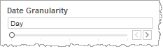
Note: If you choose to draw from hourly instead of daily summarization data, the Date Granularity filter will no longer be visible.
Custom filters
This report accommodates customizable filters.
Customizable filters narrow the scope of the reported dataset by including or excluding data with identifiable attributes. These attributes may be about the conversation itself or about an event that may have happened during the conversation.
For more information about how to add customized filters to your view, contact your Nuance Professional Services representative.
Note: If you would like to modify this or any report, Nuance Communications, Inc. recommends you contact Nuance Professional Services.
