Design Charts in Active Preview
In Interactive Design view, the canvas on the right provides a preview of the report that you are creating or modifying.
- For charts, the preview is called active because the chart image is live, not static.
- Report Creator can recognize and quickly process your mouse actions on the chart.
Bound area with dotted line:
Bound area with solid line:
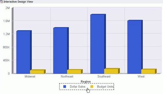
In active preview, moving the mouse over a graph element (legend, axis label, title) highlights the bounding area with a dotted line.
In active preview, selecting a graph element (legend, axis label, title) highlights the bounding area with a solid line.
Active preview, Interactive Design view right-click menu:
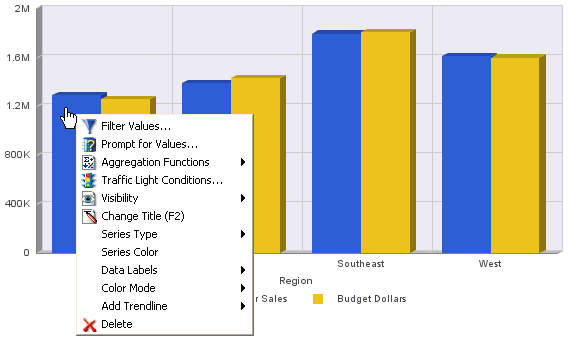
In active preview, right-clicking an element on a chart opens a menu with design options that are available for that element. Making a choice from the menu, applies it to the chart element so that you see the result right away.
Right-click menus are enabled for charts that are generated with either sample data or live data from your data source.
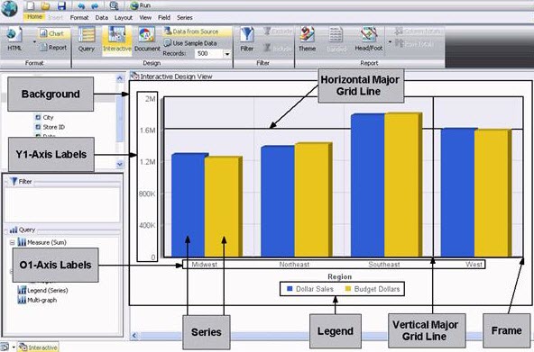
Chart elements
The illustrated elements are included on a default vertical bar chart. Depending on the type of chart that you are creating, the elements and their associated right-click menu options vary.
Customize optional elements on a chart that are not included by default.
Key customizable elements in charts
Example:
Draw minor grid lines on a bar chart and customize them using options on the minor grid line right-click menu.
For instructions on drawing minor grid lines, see Grid lines.
Custom series
A series is a data source field that is included in a chart. You can customize a series in a number of ways.
Right-clicking a series on a chart in Interactive Design view displays an options menu.
Tip: The options on the menu depend on the type of chart that you are creating. For example, you do not see Series Type for a pie chart, but you do see it for a bar, line, and area chart.
Customize a Series, Right-Click Menu Options:
Series customization right-click menu options:
|
Option |
Description |
Reference |
|---|---|---|
|
Filter Values |
Create or modify a WHERE statement, using the Filter dialog to select data that you want to display and to exclude data you do not want to see. |
Data filters. |
|
Create an auto-prompt parameter, using the Filter dialog. With this type of parameter, you are prompted for a value for a data source field when you run a report. The output displays information only for the field value that you choose. |
Autoprompts. | |
|
Assigns an aggregation value to a numeric measure field in a report. |
Measure data with aggregation values. | |
|
Traffic Light Conditionals |
Specify the color of numeric measure fields in the output, depending on conditions that you set. By default, a chart displays values that satisfy the first condition in green and values that satisfy the second condition in red. |
Traffic light conditional styles. |
|
Visibility |
Controls the display of the selected series (field) on a chart. Hide suppresses the display of the series, and the default value Show displays the series. |
Suppress a series. |
|
Change Title |
Edit the title of the selected series. In the Edit Title dialog, type the new title in the Enter Title field and click OK. To have a blank title (white space), include a single space in the field. |
|
|
Series Type |
Changes the chart type of the selected series to Bar, Line, or Area. None (default) returns the series to the chart type that was in effect before you changed it. This option applies to bar, line, and area chart types only. |
|
|
Series Color |
Choose the color of the selected series, using the Color dialog. |
Custom mackground |
|
Data Labels |
Controls the display of data labels (values) on the selected series. The default value Hide suppresses the display of labels, and the value Show displays labels. This option does not apply to the gauge chart type. |
|
|
Color Mode |
Controls how color is applied to a series (measure field) on a chart. The possible settings are By Series (the default) and By Group. For example, assume that there is only one series on a sample bar chart. The By Series setting applies the same color to all the bars in the series. The By Group setting applies a different color to each bar. |
Control color mode |
|
Draws a line on a chart to indicate a statistical trend. You can choose from the following types of Trend Lines: This option does not apply to the pie, funnel, 3D, gauge, or stock chart type. |
Trend lines. | |
|
Delete |
Removes the selected series from the report and updates the active preview accordingly. |
Measure chart data with aggregation values
Display numeric measurement data using a variety of aggregation values.
When highlighting Aggregation functions in the Design menu, an Aggregation Functions drop-down menu is displayed.
Tip: If you change the Measure (Sum) field container in the Query Design pane from Sum to Print, Count, or List, the change overrides all assigned aggregation values.
Aggregation values menu options
|
None (default) Sum, Average Count Percent of Count |
First Value Last Value |
Total Percent Row Percent Average Square |
Applied aggregation values:
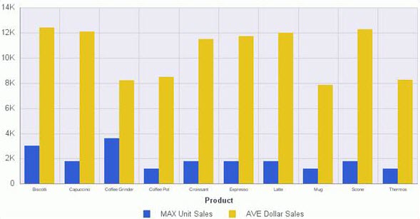
The aggregation value of Maximum (MAX) was applied to Unit Sales, and the value of Average (AVE) was applied to Dollar Sales.
Traffic light conditional styles in charts
Apply traffic light conditional styles to a selected numeric measurement field on a chart. By default, the chart displays values that satisfy the first condition in green, and values that satisfy the second condition in red.
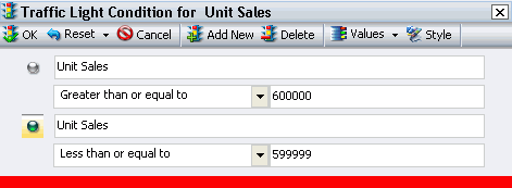
- Click Traffic Light Conditions in the design menu to open the dialog and display the green light selection fields.
- Select and type green light criteria in these fields.
- From the drop-down menu below the selected measure field name, click one of the relational operators:
- In the field to the right of the operator drop-down menu, type the desired value for the condition.
- Report Creator displays data values that meet the criteria in green in the chart output.
- In the Values drop-down menu, you can select from a number of options.
Note: Alternatively, you can click an option in the Values drop-down menu, and double-click the desired data value in the Data Values dialog that opens.
|
Equal to Not equal to Greater than |
Greater than or equal to Less than Less than or equal to |
|
Fetch All Values from Source Fetch First Value in Source Fetch Last Value in Source |
Fetch Minimum Fetch Maximum |
- In the Traffic Light Condition dialog, you can perform the following actions.
- To delete an existing traffic light condition, click Delete.
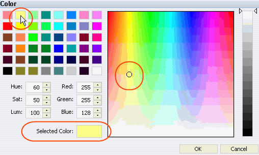
- To change colors, click Style , and then click the Font Color
 icon In the Style pop-up menu to open the Color Selection dialog.
 - To add more traffic light conditions, click Add New and select a different color for each new condition that you specify.
Traffic light condition dialog:
The Unit Sales data is displayed in either green or red, according to the criteria that was specified in the Traffic Light Condition dialog.
Sample bar chart, traffic light conditionals:
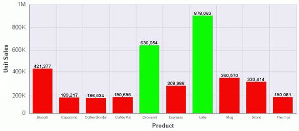
The chart also displays data labels for each Unit Sales measure value.
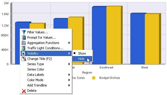
Suppressing a series
- On the menu of design options, highlight Visibility.
- On the drop-down menu, click Hide to remove the selected series.
Note: For this option to work correctly, the chart that you are designing must include more than one series.
You can restore the series in two ways:
- Right-click the name of the series in the Query Design pane in the Resources panel, highlight Visibility, and click Show from the pop-up menu.
- On the Field tab, Visibility group, use the Hidden toggle.
Hiding a chart series:
Control color mode
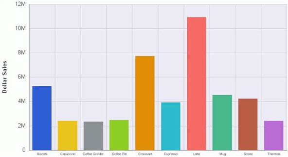
Using the Color Mode option, control how color is applied to a series (measurement field) on a chart. There are two possible settings:
-
By series (default)
-
By group
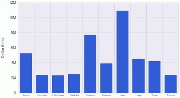
For example, if you highlight Color Mode on the design options menu and accept the default By Series setting, all bars in a single series report are displayed in the same color.
Sample chart - single color, by series:
|
|
Sample chart - multiple colors, by group
|
Custom background and frame
Background right-click menu, bar charts:
|
|
Frame right-click menu, bar charts
|
Adjust the default background and frame to achieve alternative visual effects.
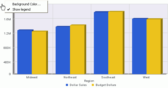
- The background of a chart is the area around the frame. By default, the background color is white.
- The background right-click menu also has an option to restore the legend if you have chosen to suppress it.
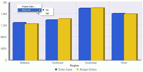
The frame of a chart is the area that contains the plot points.
- It is the area where horizontal and vertical grid lines are drawn.
- By default, the frame color is light gray, and the frame depth is 3D.
- The frame element does not apply to pie, 3D, spectral map, or pareto chart types.
Background and frame elements:
|
Element |
Option |
Description |
|---|---|---|
|
Background |
Background Color |
Specify the color of the background, using the Color dialog. See Customize the background. |
|
Show Legend |
Controls the display of the legend on the background. |
When selected, it displays the legend. When deselected, it suppresses the display of the legend. |
|
Frame |
Frame Color |
Enables you to specify the color of the frame, using the Color dialog. |
|
Show 3D |
Controls the depth of the frame. |
The default value 'On' renders the frame in 3D depth. The value 'Off' renders the frame in one dimension. See Remove 3D Depth from a Bar Chart. |
In Interactive Design view, right-click the background and click Background Color to open the Color Selection dialog.
Customizing background colors:
|
|
Sample chart with new background color
|
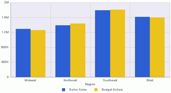
Removing 3D depth from bar charts
Menu Options to Remove 3D Depth:
|
|
Sample chart with 3D depth removed
|
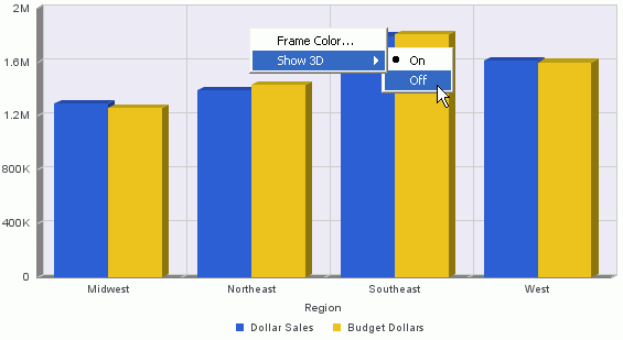
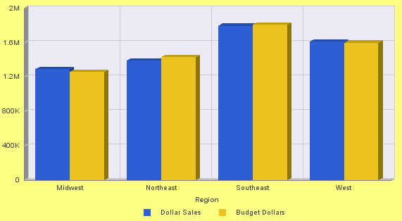
3D depth for bar charts is enabled by default.
- In Interactive Design view, right-click the frame of a bar chart to open a menu of design options.
- Highlight Show 3D, and click Off.
Custom grid lines
Right-click to customize vertical grid lines
A chart can contain several types of grid lines. All Grid Lines are drawn across the entire region of the chart.
- Minor grid lines supplement major grid lines.
- If a plot point falls in between major grid lines, use minor grid lines for more precise interpretation of the data.
Using the applicable right-click menu, remove any type of grid line or change its color.
Grid line types
| Line type | Description |
|---|---|
| Horizontal major grid lines |
Enhances the display of values, compared to the Y-axis scale alone. They are enabled by default but do not apply to the pie, 3D, gauge, spectral map, or funnel chart type. |
| Horizontal minor grid lines |
Disabled by default. They do not apply to the pie, 3D, gauge, spectral map, or funnel chart type. |
| Vertical major grid lines (ordinal axis) |
Enhances the display of values, compared to the X-axis scale alone. They are enabled by default and do not apply to pie, 3D, gauge, spectral map, or funnel chart types. |
| Vertical minor grid lines (ordinal axis) |
Disabled by default and do not apply to pie, 3D, gauge, spectral map, or funnel chart types. |
| Vertical major grid lines (numeric axis) |
Enhances the display of values, compared to the X-axis scale alone. They are enabled by default and apply only to scatter and bubble chart types, where the X-axis is numeric. |
| Vertical minor grid lines (numeric axis) |
Disabled by default and apply only to scatter and bubble chart types, where the X-axis is numeric. |
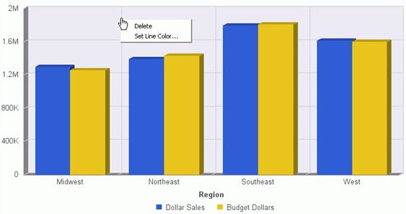
Grid line right-click options
|
Element |
Option |
Description |
|---|---|---|
|
Horizontal Major Grid Lines Horizontal Minor Grid Lines Vertical Major Grid Lines (Ordinal Axis) Vertical Minor Grid Lines (Ordinal Axis) Vertical Major Grid Lines (Numeric Axis) Vertical Minor Grid Lines (Numeric Axis) |
Delete |
Removes the grid line from the chart and updates the active preview accordingly. |
|
Set Line Color |
Specify the color of the grid line, using the Color dialog. |
Axis labels
A chart can contain the following types of Axis Labels.
- O1-axis labels are also called ordinal axis labels and do not apply to scatter, bubble, pie, funnel, or gauge chart types.
- Y1-axis labels represent a numeric scale, usually located on the left side of a vertical chart.
- Y2-axis labels represent a numeric scale, usually located on the right side of a vertical chart with dual axes or multiple axes. (Features that apply to Y2-axis labels also apply to Y3-axis, Y4-axis, and Y5-axis labels.)
- X1-axis labels appear on chart types such as scatter and bubble, where the X-axis scale is numeric.
Right-click menu options on Y1-axis label:
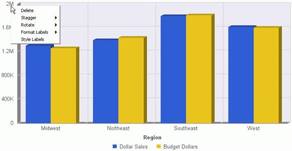
Using the applicable right-click menu, delete, stagger, rotate, and style any type of axis label.
You can also format any type of axis label except the O1-axis label.
Axis label right-click options:
Axis titles
Right-click menu options for O1-axis titles:
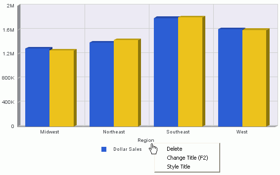
Using the applicable right-click menu, delete any type of title, change the text for the title, or style the title.
Types of axis titles for charts
| Type | Description |
|---|---|
| O1-axis title | Represents the name of a sort field in a chart. |
| Y1-axis title |
Represents the name of a measure field in a chart. By default, when there is a single measure field in the report, the title displays on the Y-axis of the chart. When there is more than one measure field, the titles of the fields appear in the legend. |
| Y2-axis title |
Represents the name of a measure field that is placed on the Y2-axis. A Y2-axis title applies only to charts with dual axes or multiple axes. |
| X1-axis title |
Represents the name of a sort field when the X-axis is numeric. An X1-axis title applies only to scatter, bubble, and XY polar chart types. |
|
Element |
Option |
Description |
||
|---|---|---|---|---|
|
O1-Axis Title Y1-Axis Title Y2-Axis Title X1-Axis Title |
Delete |
Removes the selected title from the chart and updates the active preview accordingly. |
||
|
Change Title |
||||
|
Style Title |
Applies custom style to the selected title through the Style dialog. |
|
Custom legend
The legend contains information that is necessary to accurately interpret the data on a chart.
By default, a chart displays either a Y1-axis title if there is a single measure field, or a legend if there are multiple measure fields.
Right-click the background area around the legend for two additional options:
- Legend Area Color
- Legend Border Color
Custom legend with tight-click menu options
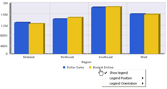
Legend right-click menu options
|
Option |
Description |
Details | |||
|---|---|---|---|---|---|
|
Show Legend |
Controls the display of the legend. |
When you check this option (the default), Report Creator displays the legend. When you deselect this option, Report Creator suppresses the display of the legend. The background right-click menu has an option to restore the legend after it has been suppressed. |
|||
|
Legend Position |
Controls the placement of the legend on the chart. |
|
|||
|
Legend Orientation |
Controls the orientation of the legend on the chart. |
Auto (the default), Vertical, Horizontal. See Legend labels. |
|||
|
Legend Area Color |
Specify the color of the legend background area. |
See Color selection. This option is available only when you right-click the area around the legend. |
|||
|
Legend Border Color |
Specify the color of the border around the legend background area. |
This option is available only when you right-click the area around the legend. See Color selection. |
