The Control Panel
The Control Panel provides access to logical groupings of all property controls and options, grouped under tabs.
- Each tab provides a collection of related groups containing button icons.
- Each tab opens a different view of the Control Panel.
- The Home tab, illustrated below, is selected by default when you first open Report Creator.
You control some properties just by clicking the button icon, while in others you select an option on a drop-down menu. Some options open dialog boxes that provide additional property controls.
List of tabs
- Home
- Insert(document view only)
- Format
- Data
- Layout
- View
- Field
- Series(displays when creating a chart)
- Slicers (not currently available)
Control Panel Home, Report group collapsed:
The layout of the Control Panel spans the width of the application window. It displays all property controls using various sized icons and groups, depending on the size of the monitor and application window.
When you reduce the size of the application window, some groups are collapsed into single buttons as determined by the amount of available space.
When a group of property controls is collapsed into a single button, the individual property icons are removed from view, but are still available.
Selecting a collapsed group button restores the group to its normal full size and displays all of the individual property icons.

The group name of an expanded group is shown along the bottom of the panel.
When expanding a collapsed group, the Control Panel collapses a neighboring group to make enough room to expand the selected group.
The Home tab
The Home tab provides control of the most commonly used properties and options from the Format, Design, Filter, and Report groups.
Report Creator Home tab groups and functions
|
Control |
Function |
|---|---|
|
Format group |
|
|
Displays the current output, and provides a drop-down menu from which you can select a different format. |
|
|
Chart / Report |
Determines whether report-specific or chart-specific functionality is available in the Report Creator tool. When you save an existing template as a new template, the default name ReportX or ChartY is provided. |
|
Design group |
|
|
Query / Interactive / Document |
The current view is highlighted. See Views.
|
|
Data from Source / Use Sample Data |
Data from Source uses the 500-record selection pulled from your source data. Sample Data shows a data mask from the Master file when creating a report. |
|
Records |
500 records are provided. You can enter a smaller number to use fewer records. |
| Filter group | |
|
Filter |
Opens the simple filter dialog. You can also create advanced filters from the Data tab. See Data Filters. |
|
Exclude / Include |
|
|
Report group |
|
|
Style |
Opens a dialog for applying global styles to the entire report. See Customized Reports . |
|
Banded (Reports only) |
Opens a color selection dialog for choosing a color that provides an alternating color scheme for the report. |
| Header and Footer |
Click the button, or drop-down the list and select an option to open the Header and Footer dialog, from which you can add and style headers and footers. |
|
Column Totals (Reports only) |
Adds a grand total row to the bottom of the report to sum numeric data in each column. |
|
Row Totals (Reports only) |
Adds a grand total column to the right side of the report to sum numeric data in each row. |
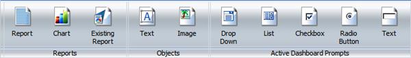
The Insert tab
The Insert tab (Document View only) enables you to add reports, charts, existing reports, text, images, and active form controls (for active report, active PDF, and active Flash outputs only) to a canvas in Document view.
Insert Tab in Document view:
|
Control |
Function |
|---|---|
|
Reports group |
|
|
Inserts a report placeholder in the top-left corner of the canvas. |
|
|
Inserts a chart placeholder in the top-left corner of the canvas. |
|
|
Opens the Open dialog where you can select an existing report to be inserted in the top-left corner of the canvas |
|
|
Objects group |
|
|
Inserts an inline text object in the top-left corner of the canvas. |
|
|
Causes an Open dialog to appear where you can browse to an image and insert it in the top-left corner of the canvas. |
|
|
Drop-down / List / Checkbox / Radio Button / Text |
Click to insert the control in the upper left corner of the canvas. |
The Format tab
The Format tab provides different options for selecting output formats and other reporting features, depending on whether you are creating a report or a chart.
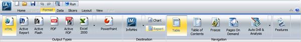
For reports, the Format tab provides access to the Output Types, Destination, Navigation (unique to reports), and Features groups.
The Format tab for reports:
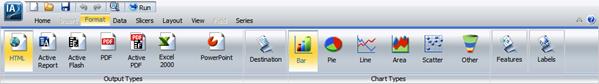
For charts, the Format tab provides access to the Output Types, Destination, Chart Types (unique to charts), Features, and Labels (unique to charts) groups.
The Format tab for charts:
|
Control |
Available Functions |
|---|---|
|
Output Types (Chart and Report) |
|
|
The current output selection is highlighted. HTML is the default for charts and reports. PDF is the default for compound documents. |
|
|
Destination |
|
|
Chart / Report |
Toggle between creating a report (the default) or a chart. |
|
Navigation (Reports Only) |
|
|
Table |
|
|
Displays a table of contents icon in the top-left corner where report output is normally displayed. Available only when HTML, active report, Excel, or PowerPoint output format is selected. |
|
|
Generates output with column titles that freeze (remain in view) when you scroll through pages of the report output. |
|
|
Features (Reports) |
|
|
Creates expandable views of data for each vertical sort field. Displays data values only for the first vertical sort field when you first view the output. You can manually expand your view to expose the data values of lower-level sort fields. Activated only when HTML or active report output format is selected. |
|
|
Repeat Sort Value |
Displays all repeated sort values in the output instead the default, which is to display blanks after the first instance of a new sort |
|
Displays all numeric measure field names in a column of the report output with the corresponding numeric data values displayed. |
|
|
Features (Charts) - Unavailable for Active Output Formats |
|
|
Sets the three-dimensional view to on or to off. The 3D Effect feature is disabled for 3D, stock, gauge, gauge thermometer, pareto, spectral map, and funnel chart types. |
|
|
Toggles between a vertical display or horizontal display of a chart. Disabled for pie, scatter, 3D, stock, gauge, gauge thermometer, pareto, spectral map, and funnel chart types. |
|
|
Opens a drop-down menu that provides the Add Reference Line to Y-Axis and Add Reference Line to X-Axis options. Disabled for pie, 3D, stock, gauge, gauge thermometer, pareto, spectral map, and funnel chart types. |
|
|
Opens a drop-down menu that provides the Add an Annotation option. |
|
|
Opens a drop-down menu that provides options to add and suppress gridlines. |
|
|
Chart Types (Charts Only) |
|
|
Bar (default) / Pie / Line / Area / Scatter |
Use to select common chart types. |
|
Opens a New Chart dialog, which offers variations on each of the chart types. You can only choose from Bar, Pie, Line, and Scatter chart variations if the output format selected is Active Report. |
|
|
Labels (Charts only) |
|
|
Use to see a menu from which you can display axis labels. The two Rotate options provide a choice of None (the default), 45, 90, and 270 degrees. |
|
|
Opens a drop-down menu, where you can select or deselect Show Legend. |
|
The Data tab
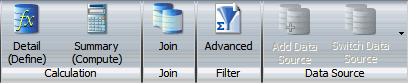
The Data tab provides access to data manipulation and data display properties and options in the Calculation, Join, Filter, and Data Source groups. Join functionality is not currently available.
| Control |
Available Functions |
|---|---|
|
Calculation |
|
|
Opens the DEFINE Field Creator dialog. |
|
|
Opens the COMPUTE Field Creator dialog. |
|
| Filter | |
|
Filter |
Opens the Filter dialog, from which you can create Advanced Data Filters. Not available when working with Reporting Objects or SAP BW, Essbase, or Microsoft SQL Server Analysis Services cubes. |
The Layout tab
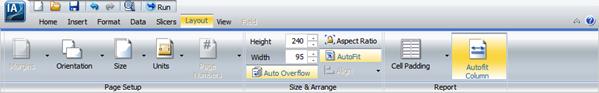
The Layout tab provides access to page display and layout options from the Page Setup, Size and Arrange (Document View only), and Report groups.
| Control |
Function |
||
|---|---|---|---|
|
Page Setup |
|||
|
Margins |
|
||
|
Orientation |
Select Portrait or Landscape. |
||
|
Size |
Select the paper size for printed output. |
||
|
Units |
Set the units of measurement to be used when customizing dimensions. |
||
|
Page Numbers (Reports Only) |
|
||
|
Size and Arrange (Document View Only) |
|||
|
Height and Width, Auto Overflow, Aspect Ratio, Autofit, and Align |
Use to lay out components in a compound document. |
||
|
Report (Reports Only) |
|||
|
Use to control the amount of space inserted between rows and columns in a report. |
|||
|
Autofit Column |
Limits the width of columns in a report to be no wider than the largest value in each column. Selected by default. |
||
The View tab
The View tab provides access to report design viewing properties and options in the Design, Show/Hide, Data Panel, Query Panel, Output Window, and Query groups as shown in the following image.

|
Control |
Function |
||||||
|---|---|---|---|---|---|---|---|
|
Design |
|||||||
|
Query / Interactive / Document |
Toggle between Query, Interactive Design, or Document View. |
||||||
|
Show/Hide |
|||||||
|
Select to minimize the resources panel and expand the results panel. |
|||||||
|
Ruler |
Show or hide the ruler. |
||||||
|
Grid |
Show or hide gridlines. |
||||||
|
Data Panel (or Resources Panel) |
|||||||
|
|||||||
|
Query Panel |
|||||||
|
Tree |
(default) No grid. |
||||||
|
Areas 2x2 |
Creates a two-column by two-row grid. |
||||||
|
Areas 1x4 |
Creates a one-column by four-row grid. |
||||||
|
Output Window |
|||||||
|
Arrange |
Opens a drop-down menu for choosing to display multiple output windows. See Output View Options. |
||||||
|
Output Location |
Opens a drop-down menu for choosing to direct new output to a Single Tab (the default), New Tab, Single Window, or New Window. See Output Target Options . |
||||||
|
Switch Output |
Opens a drop-down menu for choosing to view any active output window. |
||||||
|
Report |
|||||||
|
Switch Report |
Opens a drop-down menu for choosing any active report or chart. |
||||||

The Field tab
The Field tab displays in the Control Panel when you select a data source field in the Query Design pane or Layout Canvas. The options available in the Field tab are specific to the data type that is selected. The options available for numeric fields are different from the options available for non-numeric and date fields. The Field tab provides access to the Filter, Sort, Break, Style, Format, Specific, Visibility, and Links groups. For more information about these report options, see Custom report features.

|
Control |
Function |
|---|---|
|
Filter |
|
|
Filter |
Opens Simple Data Filters dialog. |
|
Include / Exclude |
Include or exclude a filter selected in the Query Design Pane. |
|
Opens the Filter dialog for creating an auto prompting parameter that you can select when you run a report. |
|
|
Sort |
|
|
Up / Down |
Selects ascending (default) and descending sort. |
|
Rank |
If a BY field is selected, inserts a rank column immediately to the left. If a Measure is selected, copies the field as a BY field and adds a rank column to the left of it. Therefore, ranking a Measure results in two instances of the field: the original Measure and the BY field created during ranking. |
|
Limit |
Specifies the number of unique values displayed for a sort group that has been added. |
|
Break (Reports only) |
|
|
Starts a new page when the primary sort field changes. |
|
|
Inserts a line in the report output when the primary sort field changes. |
|
|
Opens a dialog where you can type text to add a subheader just below the column titles in the report output when the primary sort field changes. |
|
|
Opens a dialog where you can type text to add a subfooter at the end of the data on each page of the report output when the primary sort field changes. |
|
|
Inserts a line, total text (TOTAL FIELD Value), and subtotals for all numeric fields when the primary sort field changes. |
|
|
Recompute |
Recalculates the result of a Compute command. Recompute is similar to Subtotal in that it recalculates only at the specified sort break. Not available for ACROSS fields. |
|
Style (Reports and Charts) |
|
|
Formats the selected field. |
|
|
Format (Reports Only) |
|
|
Provides formatting options for virtual or column fields including Alphanumeric, Integer, Decimal, Currency, Percentage, Comma, and Decimal Spaces. |
|
|
Specific |
|
|
Data Bars (Reports Only) |
Adds a data visualization column to the right of the selected numeric field. The column displays values in each row using horizontal bars that extend from left to right in varying lengths, depending on the corresponding data values. |
|
Opens a drop-down menu from which you can select an aggregation option, such as Count, Minimum, or Percent. |
|
|
Opens a dialog that allows you to provide formatting conditional on specific criteria. |
|
|
Visibility |
|
|
Hidden |
Hides the selected field. To display, click Hidden again. |
|
Links |
|
|
Link |
Opens an interface to add a link to a URL. A link to a drill down procedure is not currently available. |
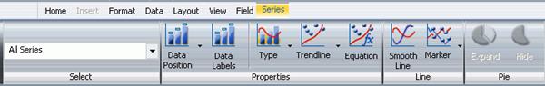
The Series tab
The Series tab, which displays in the Control Panel only when you are working with charts, provides access to chart properties and options through the Select, Properties, Line, and Pie groups.